Results for “d*mn” 11 found
The Economist covers Why Are the Prices So D*mn High?
The Economist does a very nice job covering Why Are the Prices So D*mn High.
Baumol’s earliest work on the subject, written with William Bowen, was published in 1965. Analyses like that of Messrs Helland and Tabarrok nonetheless feel novel, because the implications of cost disease remain so underappreciated in policy circles. For instance, the steadily rising expense of education and health care is almost universally deplored as an economic scourge, despite being caused by something indubitably good: rapid, if unevenly spread, productivity growth. Higher prices, if driven by cost disease, need not mean reduced affordability, since they reflect greater productive capacity elsewhere in the economy. The authors use an analogy: as a person’s salary increases, the cost of doing things other than work—like gardening, for example—rises, since each hour off the job means more forgone income. But that does not mean that time spent gardening has become less affordable.
It’s an implication of the Baumol effect that everyone ends up working in a low productivity industry!
The only true solution to cost disease is an economy-wide productivity slowdown—and one may be in the offing. Technological progress pushes employment into the sectors most resistant to productivity growth. Eventually, nearly everyone may have jobs that are valued for their inefficiency: as concert musicians, or artisanal cheesemakers, or members of the household staff of the very rich. If there is no high-productivity sector to lure such workers away, then the problem does not arise.
Misunderstanding the Baumol effect can lead to a cure worse than the “disease”:
These possibilities reveal the real threat from Baumol’s disease: not that work will flow toward less-productive industries, which is inevitable, but that gains from rising productivity are unevenly shared. When firms in highly productive industries crave highly credentialed workers, it is the pay of similar workers elsewhere in the economy—of doctors, say—that rises in response. That worsens inequality, as low-income workers must still pay higher prices for essential services like health care. Even so, the productivity growth that drives cost disease could make everyone better off. But governments often do too little to tax the winners and compensate the losers. And politicians who do not understand the Baumol effect sometimes cap spending on education and health. Unsurprisingly, since they misunderstand the diagnosis, the treatment they prescribe makes the ailment worse.
My only complaint is that the excellent reviewer has not followed our lead and called it the Baumol effect–cost disease is a misleading name!
Addendum: Other posts in this series.
SlateStarCodex and Caplan on ‘Why Are the Prices So D*mn High?’
SlateStarCodex, whose 2017 post on the cost disease was one of the motivations for our investigation, says Why Are the Prices so D*mn High (now available in print, ePub, and PDF) is “the best thing I’ve heard all year. It restores my faith in humanity.” I wouldn’t go that far.
SSC does have some lingering doubts and points to certain areas where the data isn’t clear and where we could have been clearer. I think this is inevitable. A lot has happened in the post World War II era. In dealing with very long run trends so much else is going on that answers will never be conclusive. It’s hard to see the signal in the noise. I think of the Baumol effect as something analogous to global warming. The tides come and go but the sea level is slowly rising.
In contrast, my friend Bryan Caplan is not happy. Bryan’s basic point is to argue, ‘look around at all the stupid ways in which the government prevents health care and education prices from falling. Of course, government is the explanation for higher prices.’ In point of fact, I agree with many of Bryan’s points. Bryan says, for example, that immigration would lower health care prices. Indeed it would. (Aside: it does seem odd for Bryan to argue that if K-12 education were privately funded schools would not continue their insane practice of requiring primary school teachers to have B.A.s when in fact, as Bryan knows, credentialism has occurred throughout the economy)
The problem with Bryan’s critiques is that they miss what we are trying to explain which is why some prices have risen while others have fallen. Immigration would indeed lower health care prices but it would also lower the price of automobiles leaving the net difference unexplained. Bryan, the armchair economist, has a simple syllogism, regulation increases prices, education is regulated, therefore regulation explains higher education prices. The problem is that most industries are regulated. Think about the regulations that govern the manufacture of automobiles. Why do all modern automobiles look the same? As Car and Driver puts it:
In our hyperregulated modern world, the government dictates nearly every aspect of car design, from the size and color of the exterior lighting elements to how sharp the creases stamped into sheet metal can be.
(See Jeffrey Tucker for more). And that’s just design regulation. There are also environmental regulations (e.g. ethanol, catalytic converters, CAFE etc.), engine regulations, made in America regulations, not to mention all the regulations on the inputs like steel and coal. The government even regulates how cars can be sold, preventing Tesla from selling direct to the public! When you put all these regulations together it’s not at all obvious that there is more regulation in education than in auto manufacturing. Indeed, since the major increase in regulation since the 1970s has been in environmental regulation, which impacts manufacturing more than services, it seems plausible that regulation has increased more for auto manufacturing.
As an empirical economist, I am interested in testable hypotheses. A testable hypothesis is that the industries with the biggest increases in regulation have seen the biggest increases in prices over time. Yet, when we test that hypothesis as best we can it appears to be false. Remember, this does not mean that regulation doesn’t increase prices! It can and probably does it’s just that regulation is not the explanation for the differences in prices we see across industries. (Note also that Bryan argues that you don’t need increasing regulation to explain increasing prices, which is true, but I still need a testable hypotheses not an unfalsifiable claim.)
So by all means let’s deregulate, but don’t expect 70+ year price trends to reverse until robots and AI start improving productivity in services faster than in manufacturing.
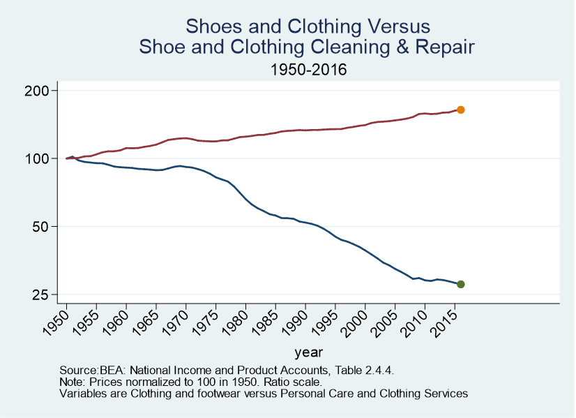
Let me close with this. What I found most convincing about the Baumol effect is consilience. Here, for example, are two figures which did not make the book. The first shows car prices versus car repair prices. The second shows shoe and clothing prices versus shoe repair, tailors, dry cleaners and hair styling. In both cases, the goods price is way down and the service price is up. The Baumol effect offers a unifying account of trends such as this across many different industries. Other theories tend to be ad hoc, false, or unfalsifiable.

Addendum: Other posts in this series.
Why Are the Prices So D*MN High?
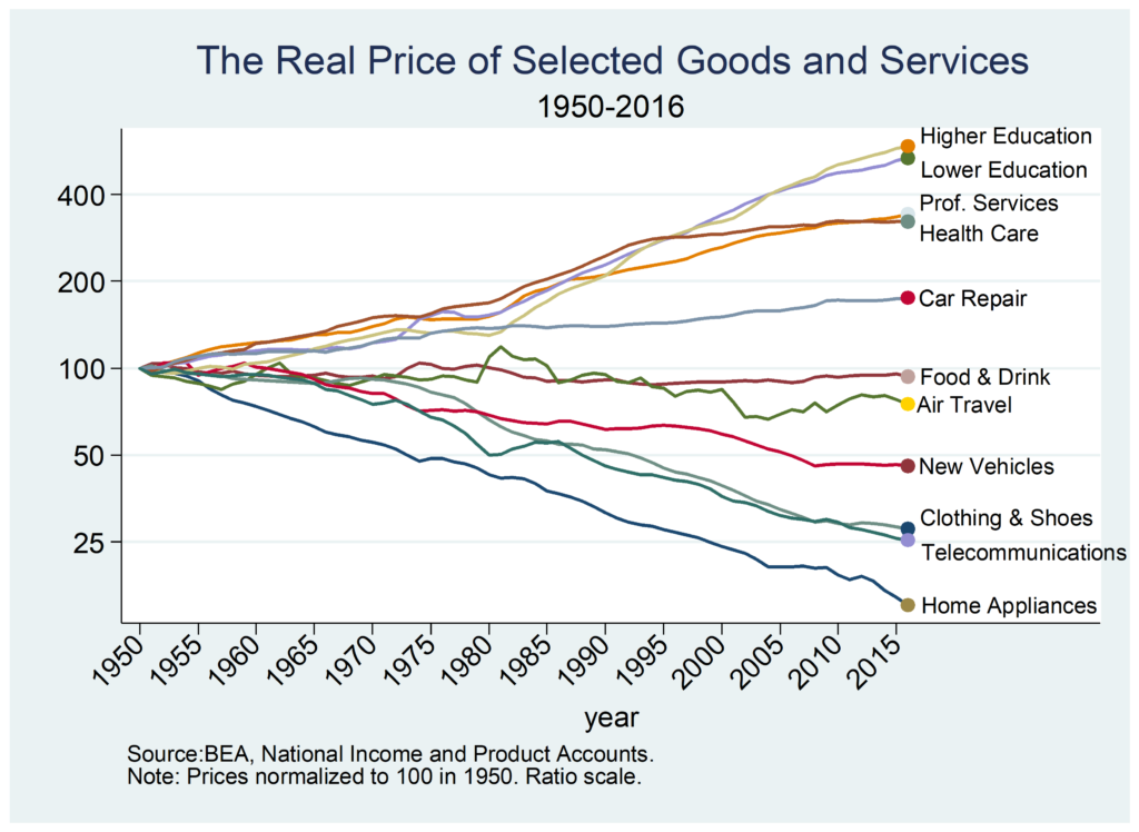
Why have some prices increased since 1950 by a factor of four while other prices have decreased by a factor of four? Technology is making so many goods and services much cheaper than in the past–that seems to be the normal situation–so why do some industries seem not only to be not progressing but actually retrogessing? As Scott Alexander put it, why are some industries so weird?
Those are the questions that motivated my latest piece, a short book with Eric Helland just released by the Mercatus Center titled, Why are the Prices so D*mn High?
In approaching this question I had some ideas in mind. I assumed that regulation, bloat and bureaucracy, monopoly power and the Baumol effect would each explain some of what is going on. After looking at this in depth, however, my conclusion is that it’s almost all Baumol effect. That conclusion radically changes one’s evaluation of price increases and decreases over the long run and it changes what, if anything, one might try to do to address such price changes.
Next week I will examine some of the evidence that pushes me towards this verdict. I’ll also take a closer look at the Baumol effect, which is mistakenly called the cost disease.
Let’s note here, however, what we need to explain. For the most part, we don’t see quick, big changes in prices that then level off. That in itself is interesting since policy tends to be discontinuous. We might expect a big regulation, for example, to cause a big increase in prices as industries adjust but then growth should return to normal. Instead, what we see and need to explain is slow, steady rising relative prices that happens over decades. Indeed, in some cases, such as education, prices have been increasing faster than average for more than a century! Puzzle over that over the long weekend. More next week!
Addendum: Other posts in this series.
Are Health Administrators To Blame?
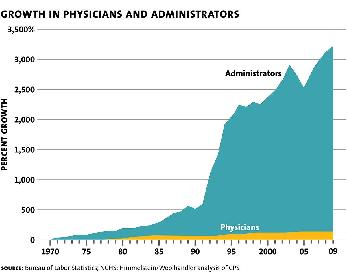
The graph at right made the twitter rounds a few days ago (1.3k RTs and 2.7k likes for Noah). The graph looked off to me immediately. Between approximately 1992 and 1994 the number of administrators went up by a factor of 4? (Or, if something goes from a 500% growth since 1970 to a 2000% growth rate since 1970, is that a factor of 3? Confusing! Anyway, a big jump.) Big jumps are often a sign that definitions, not reality, have changed. Indeed, what is an administrator?
There’s another problem with this type of graph which shows not absolute numbers but percent growth since 1970. Everything in this graph depends on getting one number, the number of administrators in 1970, exactly correct! But the first number is the one that is the farthest in the past, often the hardest to find and the most suspect. But if that first number is underestimated then every other number in the chart is overestimated.
People send me this kind of thing all the time. “See,” they say, “Why are the Prices So D*mn High is wrong! It isn’t Baumol!”–and I am always reluctant to follow-up because tracking down the underlying data, figuring out what it means, if there are mistakes etc. is a huge time sink. It was the excellent Conversable Economist who go the ball rolling on the latest iteration of this graph, however, and he cites the graph to noted health economist Uwe Reinhardt’s last book, Priced Out so I thought it could be worthwhile to go deeper.
Unfortunately, Reinhardt simply calls this a “famous graph” and it’s clear that he just found it on the internet like everyone else! Oh dear. Following up further, I did find the original Woolhandler-Himmelstein analysis written in 1991 and taking the data up to 1987. WH cite the Statistical Abstract of the United States (Table 64-2, 109th edition). You can find the SA 109th edition here but it doesn’t have the data. At least, I couldn’t find it. Ok, several hours wasted.
Finally, however, I did find a number for health administrators in an earlier edition of the SA. In the 1980 edition in Table 165, Employed Persons in Selected Health Occupations, there is a number for “Health administrators,” which says 118 thousand in 1972. Aha! Now things are beginning to make sense because from that same table there were at least 3.5 million workers (physicians, nurses, technicians and others) in health occupations and 118 thousand administrators is clearly far too low. Indeed, in a later paper Woolhandler, Campbell and Himmelstein estimate that in 1969, 18.2% of health care workers were in administration which would imply a figure of 639 thousand health administrators circa 1970, a much more plausible number.
The Woolhandler, Campbell and Himmelstein piece also finds that between 1989 and 1994 the share of health care administrators as a percent of the health care workforce increased from 25.5% to….wait for it….25.7%. In other words, no big jump and inconsistent with the huge jump seen in the graph.
It was at this point that I found Kevin Drum’s excellent analysis. Drum was also suspicious of the graph and after a lot of work he concludes that the graph exaggerates by at least a factor of 3 and probably more. Drum estimates an increase in administrators of 831%; using my initial number and Drum’s end number, I estimate an increase of 682%. All numbers to be taken with a grain of salt. Is that a big increase? Compared to what? Drum gives his best takeaway of the data as this graph, administration costs as a percent of health care costs :
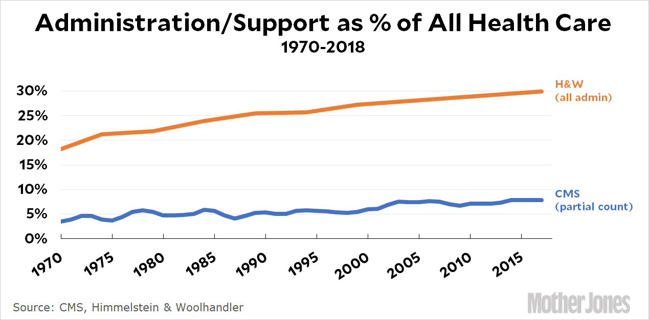
I agree with Drum–this way of presenting the data looks plausible, sensible and much less sensationalist than the original graph. Note that there has been an increase in administrative costs. Why? Here’s Drum’s bottom line:
Bottom line: the health care system has grown tremendously over the past 50 years, but that’s mostly not because we have a lot more doctors. It’s because we have MRI techs and ultrasound specialists and more kinds of nurses and more kinds of pills and enormous proton beams to cure cancer. (Those proton beams are massively expensive and require large staffs, but that doesn’t mean you need any more oncologists per patient.) To manage all this new stuff, we need bigger admin and support staffs. As a result, admin and support have grown about 50-100 percent on a relative basis. That’s the real number.
I believe the original graph uses a number for administrators that is too low in 1970 and includes what I suspect was a change in definitions around 1992 (project the 1970 to 1990 line forward or the 1994 to 2009 line backward and you will get a more accurate graph.) More generally, the graph is misleading because it suggests that “administrators” are to blame for high health care costs and if only we could focus on the “real producers” of medicine, the physicians, costs would be much lower. Blaming administrators for high prices is a lot like blaming “the middlemen.” It’s easy to say and easy to tweet but blaming the middlemen reflects a naive perspective on how goods and services are actually produced in a modern economy.
Administrative costs in the United States are high compared to other countries like Canada. (Helland and I discuss this in Why are the Prices So D*mn High.) We might even be able to lower administrative costs by moving to a single-payer, universal system. But there is no free lunch and there is no returning to an administrative free Eden.
Tabarrok, Rationally Speaking
The excellent Julia Galef interviewed me for the podcast Rationally Speaking, primarily discussing Why are the Prices So D*Mn High. Rationally Speaking (link to archive) is one of my favorite podcasts so this was a real treat.
Special Features of the Baumol Effect
I explained the Baumol effect in an earlier post based on Why Are the Prices So D*mn High?. In this post, I want to point out some special features of the Baumol effect that help to explain the data. Namely:
- The Baumol effect predicts that more spending will be accompanied by no increase in quality.
- The Baumol effect predicts that the increase in the relative price of the low productivity sector will be fastest when the economy is booming. i.e. the cost “disease” will be at its worst when the economy is most healthy!
- The Baumol effect cleanly resolves the mystery of higher prices accompanied by higher quantity demanded.

First, in the literature on rising prices it’s common to contrast massive increases in spending with little to no increases in quality, as for example, in contrasting education expenditures with mostly flat test scores (see at right). We have spent so much and gotten so little! Cui Bono? It must be teacher unions, administrators or the government!
All of that could be true but the Baumol effect predicts that more spending will be accompanied by no increase in quality. Go back to the classic example of the string quartet which becomes more expensive because labor in other industries increases in productivity over time. The price of the string quartet rises but does anyone expect that the the quality rises? Of course not. In the classic example the inputs to string quartet playing don’t change. The wages of the players rise because of productivity increases in other industries but we don’t invest any more real resources in string quartet playing and so we should not expect any increases in quality.
In just the same way, to the extent that greater spending on education, health care, or car repair is due to the rising opportunity costs of inputs we should not expect any increase in quality. (Note that increases in real resource use such as more teachers per student should result in increases in quality (and perhaps they do) but by eliminating the price increase portion of the higher spending we have eliminated a large portion of the mystery of higher spending with no increase in quality.)
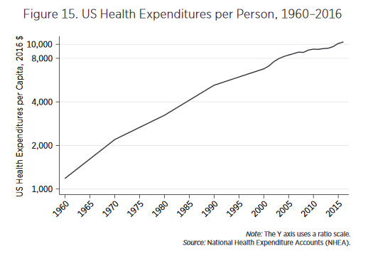 Second, explanations of rising prices that focus on bad things such as monopoly power or rent seeking tend to imply that price increases should be largest when the economy is doing poorly. In contrast, the Baumol effect predicts that increases in relative prices will be largest when the economy is booming. Consider health care. From news reports you might think that health care costs have gotten more “out of control” over time. In fact, the fastest increases in health care costs were in the 1960s. The graph at left is on a ratio scale so slopes indicate rates of growth and what one sees is that the growth rate of health expenditures per person is slowing. That might seem good but remember, from the Baumol point of view, the decline in relative price growth reflects slowing growth elsewhere in the economy.
Third, holding all else equal, the only rational response to an ordinary cost increase is to substitute away from the good. But in many rising price sectors we see not only greater expenditures (driven by increased prices and inelastic demand) but also greater quantity demanded. As I showed earlier, for example, we have increased the number of doctors, nurses and teachers per capita even as prices have risen. John Cochrane correctly noted that this is puzzling but it’s a bigger puzzle for non-Baumol theories than for Baumol. For non-Baumol theories to explain increases in the quantity purchased, we need two theories. One theory to explain the increase in price (bloat/regulation etc.) and another theory to explain why, despite the increase in price, people are still purchasing more (e.g. income effect). The world is a messy place and maybe that is what is happening. But the Baumol effect offers a cleaner answer.
A Baumol increase in relative price is always accompanied by higher income so it’s much easier to explain how price increases can accompany increases in quantity as well as increases in expenditure. The Baumol story for increased purchase of medical care even as prices increase, for example, is no more mysterious than why people can take more leisure when wages increase–namely the higher wage means a higher income for any given hours and people choose to take some of this higher income in leisure. Similarly, higher productivity in say goods production increases income at any given production level and people choose to take some of this higher income in services.
Summing up, if we examine each sector–education, health care, the arts, etc.–on its own then there are always many possible explanations for why prices might be increasing. Many of these explanations have true premises–there are a lot of administrators in higher education, health care is highly regulated, lower education is government run. But, on closer inspection the arguments often don’t fit the data very well. Prices were increasing before administrators were important, health care is highly regulated but so is manufacturing, private education is also increasing in price, the arts are not highly regulated. It’s impossible to knock down each of these arguments in every industry, so there is always room for doubt. Indeed, the great difficult is that these factors often do result in higher costs and greater inefficiency but I believe those are predominantly level effects not effects that accumulate over time. Moreover, when one considers the rising price industries as a whole these explanations begin to look ad hoc. In contrast, the Baumol effect appears capable of explaining the pricing behavior of a wide variety of industries over a long period of time using a simple but powerful and unified theory.
Addendum: Other posts in this series.
The Road Ahead for America’s Colleges & Universities
 We briefly cover higher education in Why Are the Prices So D*mn High? If you are interested in a longer treatment that covers many more issues I highly recommend Archibald and Feldman’s The Road Ahead for America’s Colleges & Universities. Archibald and Feldman reach the same conclusion we do with regard to dysfunction versus the cost disease:
We have offered two contending viewpoints about the drivers of college cost, and we have made a judgement between them. The dysfunction stories form the dominant narrative in public discussion, but we think it’s a story with weak foundations. Yet we agree that the status quo likely costs more than it could or perhaps should. You might notice that we mounted no defense of lazy rivers. Still, the cost consequences of true excesses probably are small. The major drivers of college costs are as follows (1) higher education is a service, and productivity growth in services lags productivity growth in goods; (2) higher education relies on highly educated service providers, and the income gap in favor of highly-educated workers has grown; and (3) higher education institutions adopt technology to meet a standard of care, even if meeting that standard pushes up cost.
In addition to discussing costs, Archibald and Feldman look at the demand for college, the role of the federal and state governments, online education, policy proposals such as free college and much more. Throughout their book they are data driven, analytic, and judicious.
The Baumol Effect
After looking at education and health care and doing a statistical analysis covering 139 industries, Helland and I conclude that a big factor in price increases over time in the rising price of skilled labor. Many industries use skilled labor, however, and even so prices decline so that cannot be a full explanation. Moreover, why is the price of skilled labor increasing? The Baumol effect answers both of these questions. In this post, I’ll explain the effect drawing from Why Are the Prices so D*mn High.
The Baumol effect is easy to explain but difficult to grasp. In 1826, when Beethoven’s String Quartet No. 14 was first played, it took four people 40 minutes to produce a performance. In 2010, it still took four people 40 minutes to produce a performance. Stated differently, in the nearly 200 years between 1826 and 2010, there was no growth in string quartet labor productivity. In 1826 it took 2.66 labor hours to produce one unit of output, and it took 2.66 labor hours to produce one unit of output in 2010.
Fortunately, most other sectors of the economy have experienced substantial growth in labor productivity since 1826. We can measure growth in labor productivity in the economy as a whole by looking at the growth in real wages. In 1826 the average hourly wage for a production worker was $1.14. In 2010 the average hourly wage for a production worker was $26.44, approximately 23 times higher in real (inflation-adjusted) terms. Growth in average labor productivity has a surprising implication: it makes the output of slow productivity-growth sectors (relatively) more expensive. In 1826, the average wage of $1.14 meant that the 2.66 hours needed to produce a performance of Beethoven’s String Quartet No. 14 had an opportunity cost of just $3.02. At a wage of $26.44, the 2.66 hours of labor in music production had an opportunity cost of $70.33. Thus, in 2010 it was 23 times (70.33/3.02) more expensive to produce a performance of Beethoven’s String Quartet No. 14 than in 1826. In other words, one had to give up more other goods and services to produce a music performance in 2010 than one did in 1826. Why? Simply because in 2010, society was better at producing other goods and services than in 1826.
The 23 times increase in the relative price of the string quartet is the driving force of Baumol’s cost disease. The focus on relative prices tells us that the cost disease is misnamed. The cost disease is not a disease but a blessing. To be sure, it would be better if productivity increased in all industries, but that is just to say that more is better. There is nothing negative about productivity growth, even if it is unbalanced.
In this post, I will discuss some implications of the fact that productivity is unbalanced. See the book for more discussion and speculation about why productivity growth is systematically unbalanced.
The Baumol effect reminds us that all prices are relative prices. An implication is that over time prices have very little connection to affordability. If the price of the same can of soup is higher at Wegmans than at Walmart we understand that soup is more affordable at Walmart. But if the price of the same can of soup is higher today than in the past it doesn’t imply that soup was more affordable in the past, even if we have done all the right corrections for inflation.
We can see this in the diagram at right. We have a two-good economy, Cars and Education. The production possibilities frontier shows all the combinations of Cars and Education that we can afford given our technology and resources at time 1 (PPF 1). Now suppose society chooses to consume the bundle of goods denoted by point (a). The relative price of Cars and Education is given by the slope of the PPF at that point. That price/slope tells us if we give up some education how many more cars can we get? In a market economy the price has to be given by the slope of the PPF because that is the only price at which people will willing consume the bundle of goods at point (a), i.e. it’s the equilibrium price.
Now at time 2, productivity has increased which means that with the same resources we can now have more of both goods. Productivity of Car production has increased more than that of Education production, however, so the curve shifts out more towards Cars than towards Education. Suppose society continues to consume Cars and Education in the same proportions, i.e. at point (b). The price of education must increase–and all that means is that if we give up a unit of education at point b we will get more cars than before which is the same as saying that if we want more education at point b we must give up more cars than before, i.e. the price has increased.
Notice, however, that although the price of education has increased, education is not less affordable. Indeed, at point (b) we are consuming more of both goods–broadly speaking this is exactly what has happened–namely, the price of education has increased and we now consume more of it than ever before.
When we recognize that all prices are relative prices the following simple yet deep facts follow:
- If productivity increases in some industries more than others then, ceteris paribus, some prices must increase.
- Over time, all real prices cannot fall.
In Figure 22 the economy moves from point (a) to point (b). If we graph the same transition over time it will look something like Figure 23.
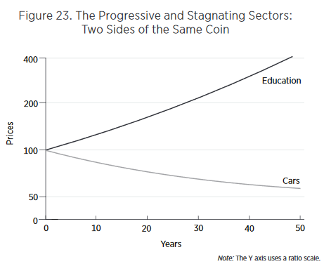
Looking at such graphs, our attention naturally is drawn to the rising cost of education. Why are costs rising so quickly? Entranced by such graphs, we may enter into a detailed analysis of the special factors of education—regulation, unionization, government purchases, insurance, international trade, and so forth—to try to explain the dramatic increase in costs. Yet the rising costs in the education sector are simply a reflection of increased productivity in the car sector. Thus, another deep lesson of the Baumol effect is that to understand why costs in the stagnant sector are rising, we must look away from the stagnating sector and toward the progressive sector.
Finally, there is one other addition to the Baumol effect which is not often recognized but worth drawing attention to. In Figure 22, I assumed that preferences were such that people wanted to consume the same ratio of goods over time so we moved from point (a) to point (b). But suppose that as we get wealthier we get tired of more cars and would like relatively more education so we move towards point (d). As we move from point (b) to point (d) we are taking resources away from car production, resources which were probably well-suited to making cars, and instead moving them towards education where they are probably less well suited. As a result as we move from point (b) to point (d) we are driving up the price of education as we try to turn auto workers into teachers. In this case, the Baumol effect gets magnified. We could alternatively move from point (b) to point (c) which would turn teachers into less productive auto workers thus driving down the price of education (i.e. increasing the price of cars). Thus, depending on preferences, the Baumol effect can be magnified or ameliorated.
As a society it appears that with greater wealth we have wanted to consume more of the goods like education and health care that have relatively slow productivity growth. Thus, preferences have magnified the Baumol effect.
Next week, I will wrap up the discussion by explaining some features of the data that the Baumol effect fits much better than do other theories.
Addendum: Other posts in this series.
The Tremendous Value of Increases in Life Expectancy
In this post I shall argue two things which together may confuse people. First, that life expectancy is so valuable that the money the US spends on healthcare relative to Europe could be well spent. Second that the extra spending is not in fact due to higher quality and does not explain rising prices over time.
What explains rising prices in some sectors of the economy? A common argument, at least from economists, is that there may be unmeasured improvements in quality. I don’t think that there have been marked improvements in quality in education so that argument doesn’t get off the ground (see my earlier post and the book for evidence). But health care quality has increased. Moreover, the value of life is so high that the improvements in quality could justify the cost increases. Here from Why Are The Prices So D*mn High is a back of the envelope calculation:
The United States spends about 5 percent more of GDP on health-care than do other developed countries. US GDP is almost $20 trillion, so 5 percent is approximately $1 trillion. The US population is 325 million, so the United States spends an extra $3,000 per person each year on healthcare. Is the expense worthwhile?
A value of a statistical life-year of around $200,000 is a mid-range, widely used estimate in the United States. Thus, if the extra US spending generated an extra $3,000 per $200,000 of a life-year, it would pay for itself. In other words, for the extra US spending to be worthwhile it must generate 3,000/200,000 × 365 = 5.45 extra days of statistical life, and, of course, it must do so every year. In recent years, life expectancy in the United States has increased by about 52 days a year. Thus, a little more than 10 percent of the increase in actual life expectancy must be a result of the extra US spending for that spending to be worthwhile. That hardly appears impossible. It’s also not impossible that the increase in life expectancy was not caused by the extra spending.
The bottom line is that the value of life is so high that US levels of spending could be worthwhile, but the high value of life and the difficulty of measuring the effectiveness of healthcare makes the question impossible to answer with certainty.
Nevertheless,I don’t think the increases in quality explain the increases in cost:
…even if the spending on healthcare is well justified by the improvements in life expectancy, it does not follow that the cause of higher spending is the improvement in life expectancy. As with education, many of the increases in life expectancy come from better knowledge, which does not necessarily cost more to use. It does not cost much more to treat an infection with antibiotics than with bloodletting; perhaps it costs less. We do use more technology in healthcare than in previous years—this includes computerized tomography (CT) scanners, magnetic resonance imaging (MRI) systems, and positron emission tomography (PET). Technology, however, is falling in price. At some point one would expect that decreases in the cost of existing technologies would overwhelm increases in costs owing to the introduction of new technologies. As with education, it would be peculiar if the only place in which technology raised costs was in healthcare (but see Joseph P. Newhouse for a strong argument that healthcare costs are driven by technology.)
Let’s put this argument more generally. Most increases in quality *over time* are similar to increases in productivity, i.e. A in A*f(K,L), an unpriced factor. Computers today are much higher quality than in the past. Indeed, so much so that today’s computers couldn’t be bought at any price not that long ago but we don’t pay more because what makes them higher quality is general knowledge.
In my view, most quality increases over time are due to improvements in knowledge. In other words, quality increases over time are much more about better recipes than better cooks. As a result, at a given point in time, higher quality is associated with higher prices but over time higher quality is more often associated with *lower* prices. Thus, in general, higher quality is not a good explanation for higher prices over time.
Tomorrow: The Baumol Effect.
Addendum: Other posts in this series.
Physician and Nurse Incomes Have Increased Tremendously
 There has been a lot of ink spilled over the rising cost of health care and in Why Are the Prices So D*mn High? Helland and I do not cover every theory and cannot satisfy every objection. Our goal is more modest. We can say that one major factor in rising health care costs is the rising price of skilled labor.

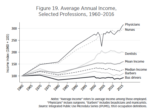
We argue that there is a direct, obvious, and measurable cause of higher costs in healthcare—namely, the price of skilled labor. No profession other than physicians has seen such large increases in incomes over the past 50 years. Figure 19 shows the real income of physicians from 1960 to 2016, indexed to 100 in 1960. Since 1960 the real income of physicians has increased by a factor of three. By comparison, barbers and bus drivers have seen essentially no increase in real incomes. Median incomes are up only modestly whereas mean incomes, which are pulled up by outliers, are up by only 50 percent.
Moreover, nurse incomes have risen in lock-step with those of physicians.
At the same time, we have hired more physicians and more nurses per capita. As Figure 20 shows since 1960 the number of physicians and the number of nurses has more than doubled.
With more physicians and more nurses each making more, it’s not surprising that the cost of medical care would increase.
Addendum: Other posts in this series.
Bloat Does Not Explain the Rising Cost of Education
In Why Are The Prices So D*mn High? Helland and I examine lower education, higher education and health care in-depth and we do a broader statistical analysis of 139 industries. Today, I will make a few points about education. First, costs in both lower and higher education are rising faster than inflation and have been doing so for a very long time. In 1950 the U.S. spent $2,311 per elementary and secondary public school student compared with $12,673 in 2013, over five times more (both figures in $2015). The rate of increase was fastest in the 1950s and 1960s–a point to which I will return later in this series.
College costs have also increased dramatically over time. For this book, we are interested in costs more than tuition because we want to know what society is giving up to produce education rather than who, in the first instance, is paying for it. Costs are considerably higher than tuition even today, although in recent years tuition has been catching up. Essentially students and their parents have been paying an increasing share of the increasing cost of higher education. Moreover, as with lower education, costs have been rising for a very long period of time.
I will take it as given that the explanation for higher costs isn’t higher quality. The evidence on tests scores is discussed in the book:
It is sometimes argued that how we teach has not changed but that what we teach has improved in quality. It is questionable whether studies of Shakespeare have improved, but there have been advances in biology, computer science, and physics that are taught today but were not in the past. However, these kinds of improvements cannot explain increases in cost. It is no more expensive to teach new theories than old. In a few fields, one might argue that lab equipment has improved, which it certainly has, but we know from figure 1 that goods in general have decreased in price. It is much cheaper today, for example, to equip a classroom with a computer than it was in the past.
The most popular explanation why the cost of education has increased is bloat. Elizabeth Warren and Chris Christie, for example, have both blamed climbing walls and lazy rivers for higher tuition costs. Paul Campos argues that the real reason college costs are growing is “the constant expansion of university administration.” Redundant administrators are also commonly blamed for rising public school costs.
 The bloat theory is superficially plausible. The lazy rivers do exist! But the bloat theory requires longer and lazier rivers every year, which is less plausible. It’s also peculiar that the cost of education is rising in both lower and higher education and in public and private colleges despite very different competitive structures. Indeed, it’s suspicious that in higher education bloat is often blamed on competition–the “amenities arms race“–while in lower education bloat is often blamed on lack of competition! An all-purpose theory doesn’t explain much.
More importantly, the data reject the bloat theory. Figure 8 shows spending shares in higher education. Contrary to the bloat theory, the administrative share of spending has not increased much in over thirty years. The research share, where you might expect to find higher lab costs, has fluctuated a little but also hasn’t risen much. The plant share which is where you might expect to find lazy rivers has even gone down a little, at least compared to the early 1980s.
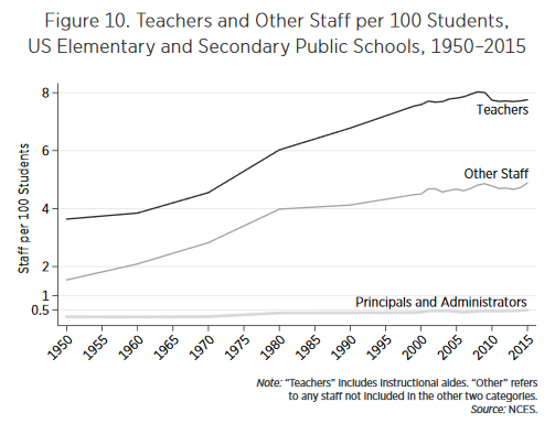 Nor is it true that administrators are taking over the public schools, see Figure 10.
Compared with teachers and other staff, the number of principals and administrators is vanishingly small, only 0.4 per 100 students over the 1950–2015 period. It is true, if one looks closely, that the number of principals and administrators doubled between 1970 and 1980. It is unclear whether this is a real increase or a data artifact (we only have data for 1970 and 1980, not the years in between during this period). But because the base numbers are small, even a doubling cannot explain much. A bloated little toe cannot explain a 20-pound weight gain. Moreover, the increase in administrators was over by 1980, but expenditures kept growing.
If bloat doesn’t work, what is the explanation for higher costs in education? The explanation turns out to be simple: we are paying teachers (and faculty) more in real terms and we have hired more of them. It’s hard to get costs to fall when input prices and quantities are both rising and teachers are doing more or less the same job as in 1950.
We are not arguing, however, that teachers are overpaid!
Indeed, it is part of our theory that teachers are earning a normal wage for their level of skill and education. The evidence that teachers earn substantially above-market wages is slim. Teachers’ unions in public schools, for example, cannot explain decade-by-decade increases in teacher compensation. In fact, most estimates find that teachers’ unions raise the wage level by only approximately 5 percent. In other words, teachers’ unions can explain why teachers earn 5 percent more than similar workers in the private sector, but unions cannot explain why teachers’ wages increase over time.
If the case for unions as a cause of rising teacher compensation in public schools is weak, it is nonexistent for increased compensation for college faculty, for whom wage bargaining is done worker by worker with essentially no collective bargaining whatsoever.
A signal to where we are heading is this:
If increasing labor costs explain the increasing price of education but teachers are not overpaid relative to similar workers in other industries, then increasing labor costs must lead to higher prices in the education industry more than in other industries.
Read the whole thing. Next up, health care.
Addendum: Other posts in this series.