Are Health Administrators To Blame?
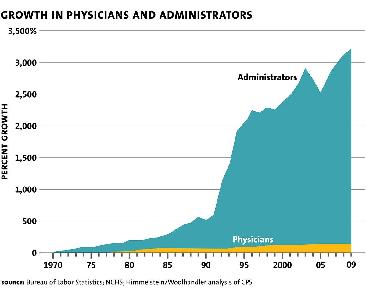
The graph at right made the twitter rounds a few days ago (1.3k RTs and 2.7k likes for Noah). The graph looked off to me immediately. Between approximately 1992 and 1994 the number of administrators went up by a factor of 4? (Or, if something goes from a 500% growth since 1970 to a 2000% growth rate since 1970, is that a factor of 3? Confusing! Anyway, a big jump.) Big jumps are often a sign that definitions, not reality, have changed. Indeed, what is an administrator?
There’s another problem with this type of graph which shows not absolute numbers but percent growth since 1970. Everything in this graph depends on getting one number, the number of administrators in 1970, exactly correct! But the first number is the one that is the farthest in the past, often the hardest to find and the most suspect. But if that first number is underestimated then every other number in the chart is overestimated.
People send me this kind of thing all the time. “See,” they say, “Why are the Prices So D*mn High is wrong! It isn’t Baumol!”–and I am always reluctant to follow-up because tracking down the underlying data, figuring out what it means, if there are mistakes etc. is a huge time sink. It was the excellent Conversable Economist who go the ball rolling on the latest iteration of this graph, however, and he cites the graph to noted health economist Uwe Reinhardt’s last book, Priced Out so I thought it could be worthwhile to go deeper.
Unfortunately, Reinhardt simply calls this a “famous graph” and it’s clear that he just found it on the internet like everyone else! Oh dear. Following up further, I did find the original Woolhandler-Himmelstein analysis written in 1991 and taking the data up to 1987. WH cite the Statistical Abstract of the United States (Table 64-2, 109th edition). You can find the SA 109th edition here but it doesn’t have the data. At least, I couldn’t find it. Ok, several hours wasted.
Finally, however, I did find a number for health administrators in an earlier edition of the SA. In the 1980 edition in Table 165, Employed Persons in Selected Health Occupations, there is a number for “Health administrators,” which says 118 thousand in 1972. Aha! Now things are beginning to make sense because from that same table there were at least 3.5 million workers (physicians, nurses, technicians and others) in health occupations and 118 thousand administrators is clearly far too low. Indeed, in a later paper Woolhandler, Campbell and Himmelstein estimate that in 1969, 18.2% of health care workers were in administration which would imply a figure of 639 thousand health administrators circa 1970, a much more plausible number.
The Woolhandler, Campbell and Himmelstein piece also finds that between 1989 and 1994 the share of health care administrators as a percent of the health care workforce increased from 25.5% to….wait for it….25.7%. In other words, no big jump and inconsistent with the huge jump seen in the graph.
It was at this point that I found Kevin Drum’s excellent analysis. Drum was also suspicious of the graph and after a lot of work he concludes that the graph exaggerates by at least a factor of 3 and probably more. Drum estimates an increase in administrators of 831%; using my initial number and Drum’s end number, I estimate an increase of 682%. All numbers to be taken with a grain of salt. Is that a big increase? Compared to what? Drum gives his best takeaway of the data as this graph, administration costs as a percent of health care costs :
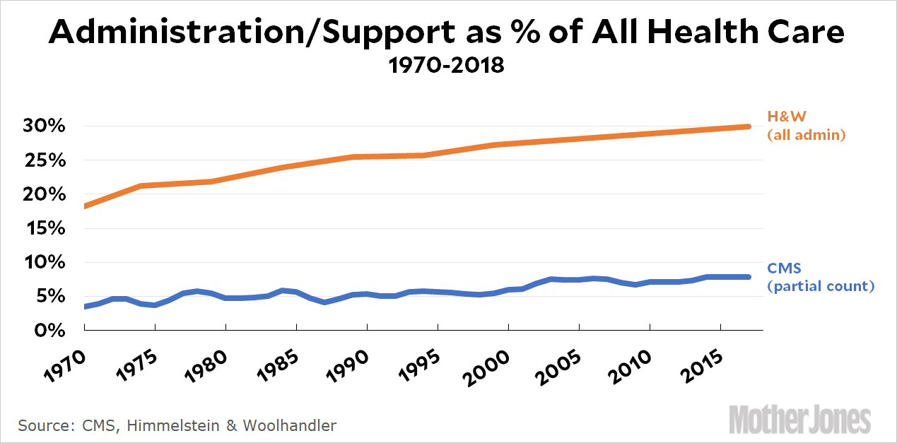
I agree with Drum–this way of presenting the data looks plausible, sensible and much less sensationalist than the original graph. Note that there has been an increase in administrative costs. Why? Here’s Drum’s bottom line:
Bottom line: the health care system has grown tremendously over the past 50 years, but that’s mostly not because we have a lot more doctors. It’s because we have MRI techs and ultrasound specialists and more kinds of nurses and more kinds of pills and enormous proton beams to cure cancer. (Those proton beams are massively expensive and require large staffs, but that doesn’t mean you need any more oncologists per patient.) To manage all this new stuff, we need bigger admin and support staffs. As a result, admin and support have grown about 50-100 percent on a relative basis. That’s the real number.
I believe the original graph uses a number for administrators that is too low in 1970 and includes what I suspect was a change in definitions around 1992 (project the 1970 to 1990 line forward or the 1994 to 2009 line backward and you will get a more accurate graph.) More generally, the graph is misleading because it suggests that “administrators” are to blame for high health care costs and if only we could focus on the “real producers” of medicine, the physicians, costs would be much lower. Blaming administrators for high prices is a lot like blaming “the middlemen.” It’s easy to say and easy to tweet but blaming the middlemen reflects a naive perspective on how goods and services are actually produced in a modern economy.
Administrative costs in the United States are high compared to other countries like Canada. (Helland and I discuss this in Why are the Prices So D*mn High.) We might even be able to lower administrative costs by moving to a single-payer, universal system. But there is no free lunch and there is no returning to an administrative free Eden.