America, in two charts, social average is over
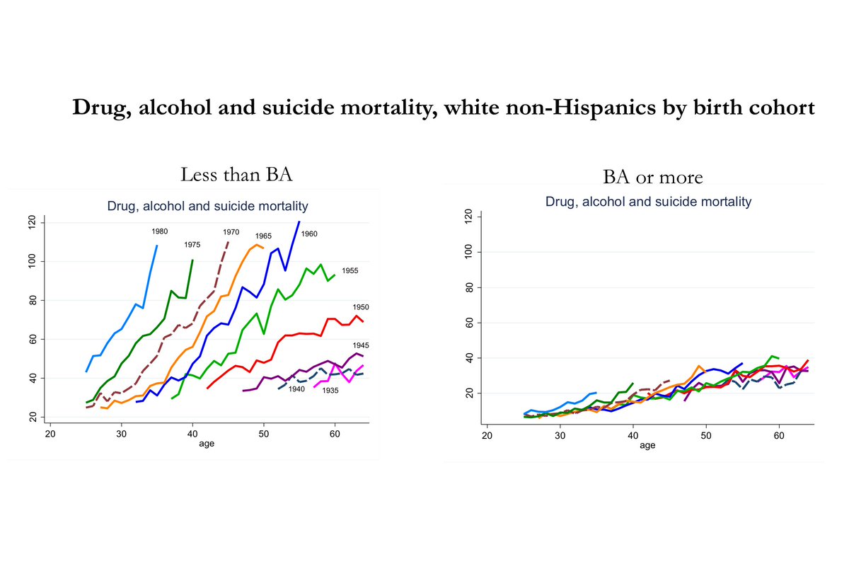
Forgive the formatting, and yes the axes are not square up (in fact it should look worse), here is the link. And here is the source with explanation, p.48.
Forgive the formatting, and yes the axes are not square up (in fact it should look worse), here is the link. And here is the source with explanation, p.48.