From a scientist, coronavirus pictures to ponder
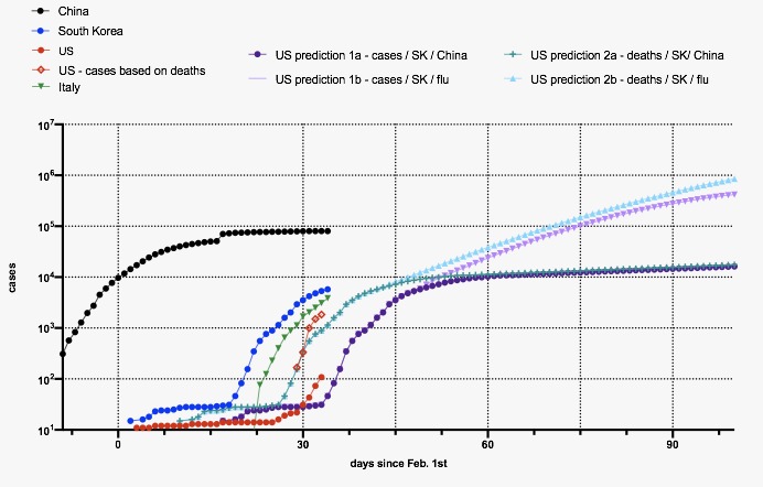
Figure legend
– Plotted in log scale!
– US cases based on deaths: estimated number of real cases using SK‘s current death rate of 0.6%
– US prediction 1a: predicted lower lower bound trajectory based on SK and China (assumes containment and large amount of testing )
– US 2a: upper bound, same assumptions as 1a
– US prediction 1b: no serious containment, trajectory similar to flu, lower bound
– 2b: Higher bound for flu-like trajectory
As I read this picture, it seems to suggest that the returns to properly done containment can be high. What do you all think?