Category: Data Source
The American fertility rate is no longer declining
The sharp decline in the country’s fertility rate during the economic downturn has come to an end, federal data show, as an improving economy encouraged Americans to resume having babies.
The number of babies born in the United States in 2012 remained flat, the first time in five years that the number did not significantly decline, according to the National Center for Health Statistics.
The leveling off capped a 9 percent decline in the fertility rate from 2007 to 2011, a drop that demographers say began after the recession took hold and Americans started feeling less secure about their economic circumstances.
By the way, economics really does seem to be a factor in these changes:
…the only state to show a slight increase in fertility between 2008 and 2009 was North Dakota, which had one of the lowest unemployment rates in the country.
The teen birth rate is falling, which is further good news. Here is more.
Chile fact of the day
…the average eighth grader in Ghana has a test score that would place her in the bottom 0.2 percent of US students. Even in considerably richer developing countries, the learning gap is large: the average Chilean student would be in the bottom 6.4 percent of US students, based on TIMSS scores.
That is from the Center for Global Development, via Charles Kenny, via Reihan, there is more here. By the way, here is the teacher response to recent educational reforms in Mexico.
The global decline of the labor share
That is the new paper by Loukas Karabarbounis and Brent Neiman, and the abstract is this:
The stability of the labor share of income is a key foundation in macroeconomic models. We document, however, that the global labor share has signi cantly declined since the early 1980s, with the decline occurring within the large majority of countries and industries. We show that the decrease in the relative price of investment goods, often attributed to advances in information technology and the computer age, induced fi rms to shift away from labor and toward capital. The lower price of investment goods explains roughly half of the observed decline in the labor share, even when we allow for other mechanisms influencing factor shares such as increasing pro fits, capital-augmenting technology growth, and the changing skill composition of the labor force. We highlight the implications of this explanation for welfare and macroeconomic dynamics.
In other words, capital-labor substitutability is very real. The full piece is here (pdf).
The Autor, Dorn, and Hanson paper on trade and technology
Several other bloggers already have covered this important paper, but there remain underexplored details. Overall the main result is that trade has had more of a negative impact on employment than we used to think. I won’t attempt a summary, but here are a few further results of note:
1. In the Providence, Rhode Island area the trade exposure to China for 2000-2007 went up by $3,490 per worker. For New Orleans the same increase was only $490 per worker.
2. Technology gains and mechanization in a region do not predict employment declines, but they do predict polarization of wage returns. (I do think that automation will create problems for labor markets, but I think that issue is more about our future. It also was true, for a while, in our more distant past, as outlined by David Ricardo.)
3. The negative employment effects of technology on manufacturing jobs peaked in the 1980s, and since have declined. The negative employment effects of technology on service sector jobs have been rising. On net the effect on employment across all sectors has stayed roughly constant over the last few decades.
4. Women and older workers are those most likely to lose their jobs because of technology.
5. The employment effects of exposure of a region to Chinese imports are significant. A good deal of this effect works through the labor force participation rate rather than through measured unemployment per se. This by the way is one indication that the labor force participation rate does contain relevant information about the health of the labor market.
6. The authors classify jobs into the categories of abstract, routine, and manual, and suggest that routine jobs are most vulnerable to automation. Maybe, but I would not take this for granted. Better software in a car can forestall mechanical problems, and thus replace the manual labor of the automobile mechanic, even if we cannot imagine how a robot could itself do the car repair work.
South Korea fact of the day
In 2011, the average age of a first marriage for South Korean women hit 29.14, up from 24.8 in 1990; for men it jumped to 31.8 from 27.9 in 1990. The birthrate sunk to 1.15 children per woman, the lowest among the world’s most developed countries.
The full story, about matchmaking in South Korea, is here.
Singapore has a very low wage share
Singapore has one of the highest GDP per capita in the world. However, our wage share of GDP (at around 43 per cent) is lower than the shares of most developed economies (at 50 per cent or more).
Of course Singapore is one of the wealthiest countries in the world.
You will find a variety of interesting graphs at this pdf link. That is from the Economic Survey of Singapore, more here.
The Value of a CEO
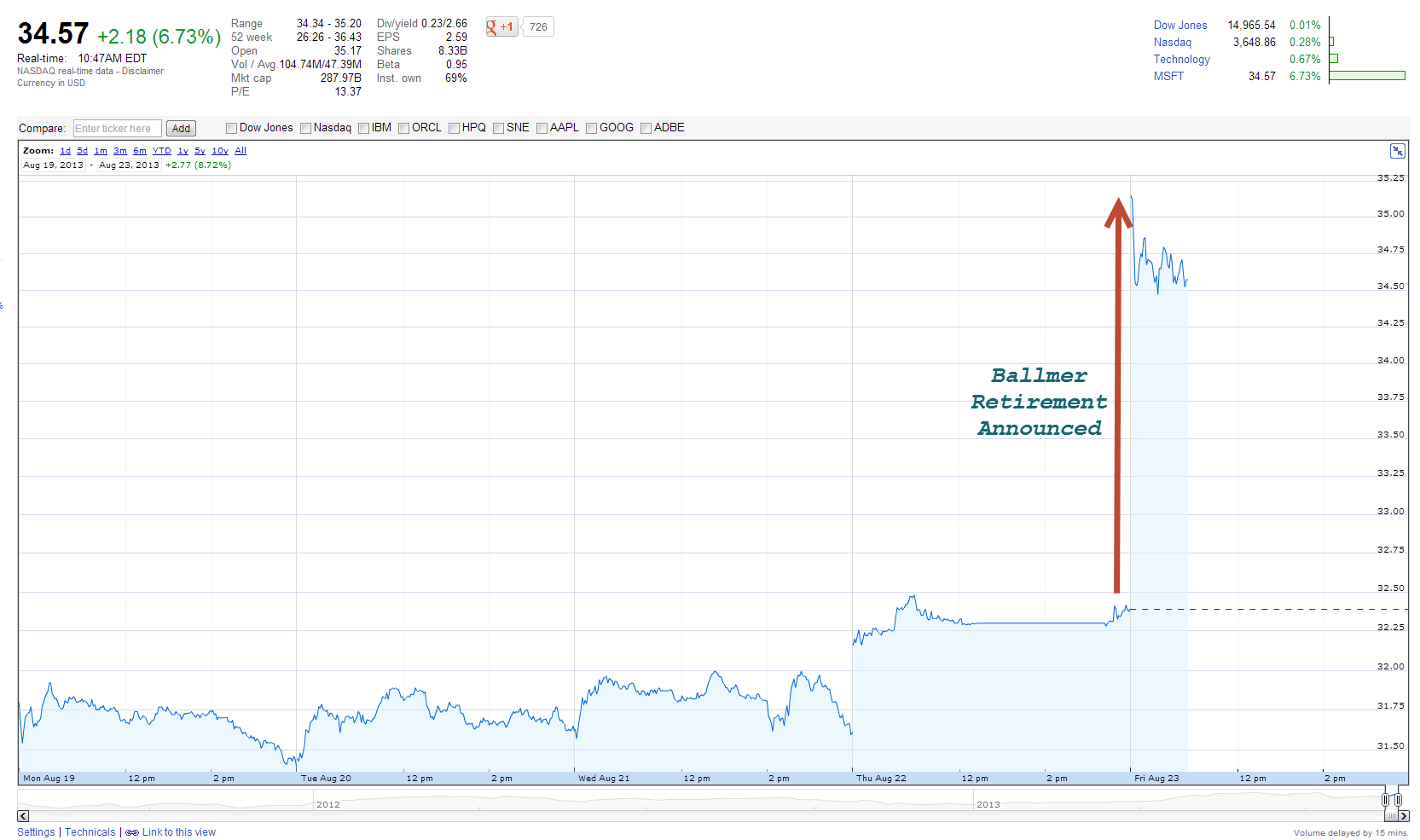
Steven Ballmer announced today that he would retire. Microsoft stock shot up immediately by ~$2.18 or 6-7%. Given 8.33 billion shares outstanding that’s an increase in value of about $18 billion dollars. Of course that’s embarrassing for Ballmer but the lesson cuts both ways. If Ballmer’s exit and replacement with an unknown is worth $18 billion then hiring the right CEO at $27 million annually, the average annual pay for the 100 highest paid CEOs in America, looks like a bargain. Small differences are a big deal for large corporations, you know like a marginal… something or other.
Hat tip: Justin Wolfers.
An update on labor market polarization
Here is Mark Thoma quoting Josh Lehner:
What we see here is strong job growth at both the top and bottom ends of the wage spectrum. Yes, food preparation and personal care account for a disproportionately large share of jobs gained in recent years, but so too have business and financial services, healthcare practitioners, computer and mathematical occupations and management. Where we have seen slower growth is in the middle. The light blue bars, which I term lower middle-wage jobs account for about 40% of all occupations in 2012 yet account for just 26% of the growth. The dark blue bars, which I term upper middle-wage jobs, account for another 19% of all occupations and 0% of the growth. This, by definition, is job polarization.
There are useful pictures at the link.
Why has growth in per capita Medicare spending slowed down?
There is a new CBO study, which I have not read, but which is noteworthy virtually by definition. The abstract is here:
Growth in spending per beneficiary in the fee-for-service portion of Medicare has slowed substantially in recent years. The slowdown has been widespread, extending across all of the major service categories, groups of beneficiaries that receive very different amounts of medical care, and all major regions. We estimate that slower growth in payment rates and changes in observable factors affecting beneficiaries’ demand for services explain little of the slowdown in spending growth for elderly beneficiaries between the 2000–2005 and 2007–2010 periods. Specifically, available evidence does not support a finding that demand for health care by Medicare beneficiaries was measurably diminished by the financial turmoil and recession. Instead, much of the slowdown in spending growth appears to have been caused by other factors affecting beneficiaries’ demand for care and by changes in providers’ behavior. We discuss the contribution that those factors may have made to the slowdown in spending growth and the difficulties in quantifying those influences and predicting their persistence.
The full paper (pdf) is here.
What explains regional variation in health care spending?
It doesn’t seem to be demand side factors, but rather what doctors believe, including false beliefs. That is scary. There is a new NBER paper by David Cutler, Jonathan Skinner, Ariel Dora Stern, and David Wennberg and the abstract is this:
There is considerable controversy about the causes of regional variations in healthcare expenditures. We use vignettes from patient and physician surveys, linked to Medicare expenditures at the level of the Hospital Referral Region, to test whether patient demand-side factors, or physician supply-side factors, explains regional variations in Medicare spending. We find patient demand is relatively unimportant in explaining variations. Physician organizational factors (such as peer effects) matter, but the single most important factor is physician beliefs about treatment: 36 percent of end-of-life spending, and 17 percent of U.S. health care spending, are associated with physician beliefs unsupported by clinical evidence.
There is an earlier ungated version here (pdf).
Why are new unemployment claims so low?
Scott Sumner reports:
…the ratio of new [unemployment] claims to pop is roughly back to the boom levels of 1999-2000 and 2006-07. And yet the other indicators (total jobs, unemployment rate, etc), remain deeply depressed. I can think of two ways to interpret this data:
1. Casey Mulligan is right, we have lots of structural issues that are causing high unemployment right now. The job market’s not that bad, it’s just that lots of people don’t want to work at the wages being offered, or are frozen out by the 40% rise in minimum wages during the housing bust.
2. AD is still the main problem, but since 1975 there’s been a long term downward trend in the claims/pop ratio, for some mysterious reason. That trend would explain why (according to new claims) the labor market looked as good in 2006 as 2000, even though most people think it was not.
On this topic, here is a kebko post of interest; he argues that employment has more or less recovered, once we adjust for various obstacles.
How much does bad Chinese data on real estate prices matter?
The excellent Christopher Balding has the scoop:
Baseline Chinese economic data is unreliable. Taking published National Bureau of Statistics China data on the components of consumer price inflation, I attempt to reconcile the official data to third party data. Three problems are apparent in official NBSC data on inflation. First, the base data on housing price inflation is manipulated. According to the NBSC, urban private housing occupants enjoyed a total price increase of only 6% between 2000 and 2011. Second, while renters faced cumulative price increases in excess of 50% during the same period, the NBSC classifies most Chinese households has private housing occupants making them subject to the significantly lower inflation rate. Third, despite beginning in the year 2000 with nearly two-thirds of Chinese households in rural areas, the NSBC applies a straight 80/20 urban/rural private housing weighting throughout our time sample. This further skews the accuracy of the final data. To correct for these manipulative practices, I use third party and related NBSC data to better estimate the change in consumer prices in China between 2000 and 2011. I find that using conservative assumptions about price increases the annual CPI in China by approximately 1%. This reduces real Chinese GDP by 8-12% or more than $1 trillion in PPP terms.
If you would like to hear what is wrong encapsulated in a nutshell, try this:
According to [official] NBSC data, the food component of the CPI in China as responsible for 99% of inflation between 2003 and 2011. Thinking of this another way, this implies that the NBSC is claiming that the only prices to rise in china between 2003 and 2011 were food prices.
The Great Reset, labor market edition
Fabio Rojas on Twitter as an electoral predictor
It turns out that what people say on Twitter or Facebook is a very good indicator of how they will vote.
How good? In a paper to be presented Monday, co-authors Joseph DiGrazia, Karissa McKelvey, Johan Bollen and I show that Twitter discussions are an unusually good predictor of U.S. House elections. Using a massive archive of billions of randomly sampled tweets stored at Indiana University, we extracted 542,969 tweets that mention a Democratic or Republican candidate for Congress in 2010. For each congressional district, we computed the percentage of tweets that mentioned these candidates. We found a strong correlation between a candidate’s “tweet share” and the final two-party vote share, especially when we account for a district’s economic, racial and gender profile. In the 2010 data, our Twitter data predicted the winner in 404 out of 406 competitive races.
There is more here.
The origins of the Forbes 400
Here is another interesting passage from the newly published Kaplan and Rauh paper “It’s the Market: The Broad-Based Rise in the Return to Top Talent“:
…the percent [of the Forbes 400] that grew up wealthy fell from 60 to 32 percent while the percent that grew up with some money in the family rose by a similar amount. The percent who grew up with little or no wealth remained about flat.
That is from 1982 to 2011, by the way. The overall tendency is this:
Overall, Figures 5 and 6 show a trend in the Forbes 400 list away from people who grew up wealthy and inherited businesses towards those who grew up with more modest wealth in the family and started their own businesses. These changes largely occurred between 1982 and 2001…
Access to education also appears to be of increasing importance. The share of the Forbes 400 who graduated from college rose from 77 to 87 percent between 1982 and 2011. The share of college dropouts (like Bill Gates and Mark Zuckerberg) also rose from 6 to 8 percent. At the same time, the share of those without any college dropped markedly from 17 to 5 percent.
I view it this way. Generational connections now matter less and starting with lots of working capital matters less. Smarts, drive, and education all matter more.