Category: Data Source
The origins of the Forbes 400
Here is another interesting passage from the newly published Kaplan and Rauh paper “It’s the Market: The Broad-Based Rise in the Return to Top Talent“:
…the percent [of the Forbes 400] that grew up wealthy fell from 60 to 32 percent while the percent that grew up with some money in the family rose by a similar amount. The percent who grew up with little or no wealth remained about flat.
That is from 1982 to 2011, by the way. The overall tendency is this:
Overall, Figures 5 and 6 show a trend in the Forbes 400 list away from people who grew up wealthy and inherited businesses towards those who grew up with more modest wealth in the family and started their own businesses. These changes largely occurred between 1982 and 2001…
Access to education also appears to be of increasing importance. The share of the Forbes 400 who graduated from college rose from 77 to 87 percent between 1982 and 2011. The share of college dropouts (like Bill Gates and Mark Zuckerberg) also rose from 6 to 8 percent. At the same time, the share of those without any college dropped markedly from 17 to 5 percent.
I view it this way. Generational connections now matter less and starting with lots of working capital matters less. Smarts, drive, and education all matter more.
The Animals are Also Getting Fat
In a remarkable paper Allison et al. (2011) gather data on the weight at mid-life from 12 animal populations covering 8 different species all living in human environments. Dividing the sample into male and female they find that in all 24 cases animal weight has increased over the past several decades.
Cats and dogs, for example, both increased in weight. Female cats increased in body weight at a rate of 13.6% per decade and males at 5.7% per decade. Female dogs increased in body weight at a rate of 3% per decade and males at a rate of 2.2% per decade.
One ready, although not necessarily correct explanation, is that fat people feed their cats and dogs more and exercise them less. Thus, the authors also looked at animals not directly under human control such as rats.
…For the 1948–2006 time period, male rats trapped in urban
Baltimore experienced a 5.7 per cent increase in body
weight per decade from 1948 to 2006 and a nearly
20 per cent increase in the odds of obesity. Similarly,
female rats trapped in urban Baltimore experienced a
7.22 per cent per decade increase in body weight, along
with a 26 per cent increase in the odds of obesity.
that too has a ready, although not necessarily correct, explanation:
… just as human real wealth and food
consumption have increased in the United States, rats
which presumably largely feed on our refuse, may also
be essentially richer.
To counter both of these objections the authors do something very clever, they gather data on the weight of control mice used in many different experiments over decades.
Among mice in control groups in the National Toxicology
Programme (NTP), there was a 11.8 per cent
increase in body weight per decade from 1982 to 2003
in females coupled with a nearly twofold increase in the
odds of obesity. In males there was a 10.5 per cent
increase per decade.
Control mice are typically allowed to feed at will from a controlled diet that has not varied much over the decades, making obvious explanations less plausible. Could mice have gained weight due to better care? Possibly although that is speculative.
More generally, there are specific explanations for the weight gain in each of the animal populations, just as there are for humans. Each explanation looks plausible taken on its own but is it plausible that each population is gaining weight for independent reasons? Could there instead be a unifying explanation for the weight gain in all populations? No one knows what that explanation is: toxins? viruses? epigenetic factors? I am not ready to jump on any of these bandwagons and in some cases the author’s samples are small so I am not yet fully convinced of the underlying facts, nevertheless this is intriguing and important research.
Hat tip: David Berreby writing in Aeon about The Obesity Era.
Liberalization Increases Growth
In Assessing Economic Liberalization Episodes: A Synthetic Control Approach (wp version), Billmeier and Nannicni evaluate economic liberalizations, defined as “comprehensive reforms that extend the scope of the market, and in particular of international markets,” over the period 1963-2005. The authors compare real per-capita GDP in treatment countries with that in a synthetic control, a weighted average of similar countries with the weights optimized so that the synthetic control matches as well as possible a variety of pre-treatment characteristics including secondary school enrollment, population growth, and the investment share as well as GDP. The results are often impressive, for example.
[In Indonesia] the average income over the years before liberalization is literally identical to that of the synthetic control, which consists of Bangladesh (41%), India
(23%), Nepal (23%), and Papua New Guinea (13%). After the economic liberalization in 1970, however, Indonesian GDP per capita takes off and is 40% higher than the estimated counterfactual after only five years and 76% higher after ten years.
Here is a selection of figures (see the paper for more). In each case the solid line is the liberalizing country and the dashed line the synthetic control.
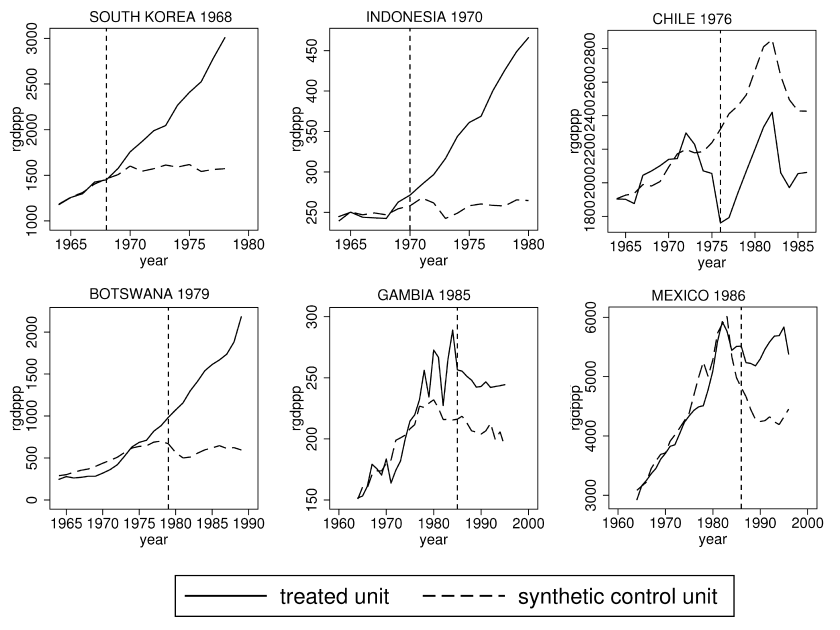
To be sure, not all liberalizations are successful. In particular, liberalizations in Africa especially after 1991 appear to be less successful. Whether this is because these liberalizations were half-hearted, were not combined with other institutional improvements or because countries that liberalized earlier were better able to link to global supply chains, is unclear. See the paper for more discussion.
These results bolster similar earlier findings from Warciarg and Welch (2008) who, using different methods, examined the average effect of liberalizations on growth from a wide variety of countries over a 50 year period. They found that on average growth increased after liberalization by a remarkable 1.5 percentage points. Here is the key figure.
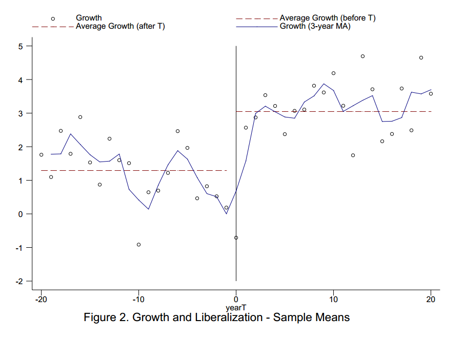
See Development and Trade: The Empirical Evidence, a video from MRU, for more on the WW study as well as other types of evidence.
Has the U.S. labor market adjusted?
Via Ashok Rao, this is a scary chart:
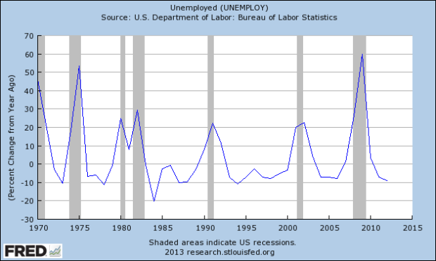
If read “crudely,” the chart suggests that in terms of percentage changes, we already have seen a historically normal level of adjustment. There is an interesting discussion at the link.
By the way, if you’re not already, you all should be reading Ashok Rao.
Credit growth vs. investment growth
That’s private non-financial credit growth, and the scatter plot of countries looks like this:
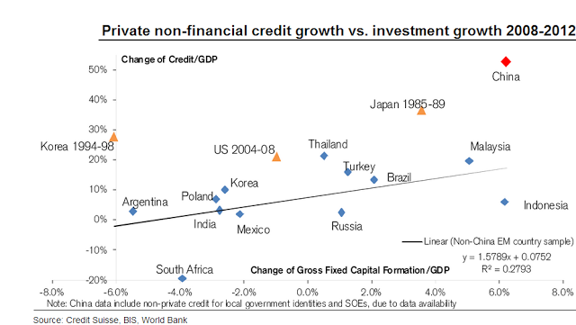
China appears to be well past the danger territory of Japan from the late 1980s. That is from Sober Look citing Credit Suisse.
How dangerous are cell phones when driving?
Maybe not as much as you think. Here is the abstract from a new paper (AEA gate) by Saurabh Bhargava and Vikram S. Pathania:
We investigate the causal link between driver cell phone use and crash rates by exploiting a natural experiment induced by the 9pm price discontinuity that characterizes a majority of recent cellular plans. We first document a 7.2 percent jump in driver call likelihood at the 9pm threshold. Using a prior period as a comparison, we next document no corresponding change in the relative crash rate. Our estimates imply an upper bound in the crash risk odds ratio of 3.0, which rejects the 4.3 asserted by Redelmeier and Tibshirani (1997). Additional panel analyses of cell phone ownership and cellular bans confirm our result.
Here is another way to put the puzzle:
Cell phone ownership (i.e., cellular subscribers/population) has grown sharply since 1988, average use per subscriber has risen from 140 to 740 minutes a month since 1993, and surveys indicate that as many as 81 percent of cellular owners use their phones while driving—yet aggregate crash rates have fallen substantially over this period.
I don’t want you to start or continue this practice, as numerous other studies do find significant risk. Still, maybe this matter is not quite as settled as many people think.
Here is a non-gated version of the paper (pdf), and the official ungated version is here.
Why don’t economists study Haiti more?
Tate Watkins, referring to an old Chris Blattman post, asks me such a question. One might raise a similar query about Sri Lanka. In both cases there are some obvious answers, having to do with ease of access and languages and also levels of violence (in the past, if not always today).
But I would like to raise a more general issue and I hope the development economists and social scientists reading this can add their expertise in the comments section. To what extent is the choice of venue for study due to what I will call “social science infrastructure”?
I don’t mean roads and bridges. I mean having trained armies of local assistants, data gathering and processing facilities, populations which are used to signing informed consent forms, medical clinics which understand how to work with social scientists and register data, and other less visible assets. I once visited a Poverty Action Lab evaluation in Hyderabad and it struck me immediately just how much local assistance they needed to get their study of micro-credit off the ground. As far as I could tell, the local assistance seemed really quite able but of course that cannot be taken for granted in all locales.
It has struck me for a while just how many RCT papers appear to be set in a relatively small number of places in Kenya. Presumably these parts of Kenya have a very good social science infrastructure.
So what is going on here? Who can shed light on this? And to what extent does having a good social science infrastructure correlate with other features which will bias the results of these studies?
For-profit education is better than we thought
From today’s Inside Higher Ed, there is now a revised version (pdf) of the Kevin Lang and Russell Weinstein paper which was very critical of the returns from for-profit education. The new results are more like this:
The two economists, who were not available for comment, apparently tweaked their methodology and came to a different conclusion about the relative value of credentials earned at for-profits.
“We find no statistically significant differential return to certificates or associates degrees between for-profits and not-for-profits,” they wrote in the paper, which was released last month.
Certificate holders from for-profits tended to fare slightly worse in the job market, according to the study, while associate degrees from for-profits were worth slightly more than those from nonprofit institutions. Hence no clear winner emerged.
The revised paper still included some worrisome findings about for-profits. Those colleges are typically more expensive than their nonprofit counterparts, particularly community colleges. For-profits charged an average of $6,300 more in annual tuition for certificate programs, according to the study’s sample, and $6,900 more per year for associate degrees.
“The return on investment is undoubtedly lower at for-profits,” the paper said.
At least this time around, the real world falls in line (somewhat) with the theory.
Deflation risk
There is a new paper by Matthias Fleckenstein, Francis A. Longstaff, and Hanno Lustig which serves up some very useful data, here is the abstract:
We study the nature of deflation risk by extracting the objective distribution of inflation from the market prices of inflation swaps and options. We find that the market expects inflation to average about 2.5 percent over the next 30 years. Despite this, the market places substantial probability weight on deflation scenarios in which prices decline by more than 10 to 20 percent over extended horizons. We find that the market prices the economic tail risk of deflation very similarly to other types of tail risks such as catastrophic insurance losses. In contrast, inflation tail risk has only a relatively small premium. Deflation risk is also significantly linked to measures of financial tail risk such as swap spreads, corporate credit spreads, and the pricing of super senior tranches. These results indicate that systemic financial risk and deflation risk are closely related.
The NBER link is here. An ungated SSRN version is here. Here is a Krugman post on high inflation becoming increasingly rare.
Where is income mobility high and low?
Climbing the income ladder occurs less often in the Southeast and industrial Midwest, the data shows, with the odds notably low in Atlanta, Charlotte, Memphis, Raleigh, Indianapolis, Cincinnati and Columbus. By contrast, some of the highest rates occur in the Northeast, Great Plains and West, including in New York, Boston, Salt Lake City, Pittsburgh, Seattle and large swaths of California and Minnesota.
Check out the map at the NYT link. Based on eyeballing, western North Dakota seems to do best and northwestern Mississippi seems to do worst.
This is based on work by Raj Chetty, Patrick Kline, and Emmanuel Saez, and the other results are quite interesting:
The researchers concluded that larger tax credits for the poor and higher taxes on the affluent seemed to improve income mobility only slightly. The economists also found only modest or no correlation between mobility and the number of local colleges and their tuition rates or between mobility and the amount of extreme wealth in a region.
But the researchers identified four broad factors that appeared to affect income mobility, including the size and dispersion of the local middle class. All else being equal, upward mobility tended to be higher in metropolitan areas where poor families were more dispersed among mixed-income neighborhoods.
Income mobility was also higher in areas with more two-parent households, better elementary schools and high schools, and more civic engagement, including membership in religious and community groups.
Regions with larger black populations had lower upward-mobility rates. But the researchers’ analysis suggested that this was not primarily because of their race. Both white and black residents of Atlanta have low upward mobility, for instance.
Of course that is all correlation and not causation per se. The Google link to the original research ought to be here, but right now the available links are down, perhaps soon they will come back up again.
Wealth taxes: a future battleground
That is my latest New York Times column, and it starts with this:
IF you’d like to know where American political debates are headed, the data suggest a simple answer. The next major struggle — in economic terms at least — will be over whether taxes on personal wealth should rise — and by how much.
The mathematical reality is that wealth is becoming more important, relative to income. In a new paper, “Capital Is Back: Wealth-Income Ratios in Rich Countries 1700-2010,” Professors Thomas Piketty and Gabriel Zucman of the Paris School of Economics have performed the heroic task of measuring wealth for eight leading economies: the United States, Canada, Britain, France, Italy, Germany, Japan and Australia.
Their estimates reveal some striking trends. For instance, wealth accumulation in these eight countries has risen relative to yearly production. Wealth-to-income ratios in these nations climbed from a range of 200 to 300 percent in 1970 to a range of 400 to 600 percent in 2010. Behind the changing ratios is some bad news, namely that slow productivity growth and slow population growth have depressed income growth, but also some good news — that relative peace and capital gains have preserved wealth.
I would say that we have much become much more efficient in preserving old wealth than in creating new wealth, and this is overall a worrying trend.
I argue that debt to wealth ratios are usually manageable, even in the case of Japan. The real issue is that politics can make it very difficult to tax wealth and in that sense fiscal problems remain real and are fundamentally tied to governance, not debt to gdp ratios.
Overall I favor consumption taxes myself, for the traditional reasons. But with rising wealth to income ratios, governments are sure to look where the money is. I expect this to be a major battle, as it already is in Italy with the recent debate over the IMU property taxes.
There is much more in the column, you can read the whole thing here.
Is there a Flynn effect for dementia?
It seems so:
A new study has found that dementia rates among people 65 and older in England and Wales have plummeted by 25 percent over the past two decades, to 6.2 percent from 8.3 percent, the strongest evidence yet of a trend some experts had hoped would materialize.
Another recent study, conducted in Denmark, found that people in their 90s who were given a standard test of mental ability in 2010 scored substantially better than people who reached their 90s a decade earlier. Nearly one-quarter of those assessed in 2010 scored at the highest level, a rate twice that of those tested in 1998. The percentage severely impaired fell to 17 percent from 22 percent.
From Gina Kolata, there is more here.
Real Gross Domestic Private Product, 2000–2012
In a new paper, Robert Higgs reports:
Until World War II and the postwar years, when the federal bureaucracy institutionalized the government’s preferred method for calculating national income, economists offered sound arguments for excluding government spending from estimates of gross domestic product. Using their general approach reveals that the private economy’s performance for the past thirteen years has been only somewhat better than complete stagnation.
I don’t think that zero counting of government consumption is the correct approach here, but this is nonetheless an interesting exercise. Keep in mind that even if government outputs are highly useful, many of them are closer to intermediate than final products. In other cases the output may be useful, and a final product, but not valued at actual market prices. There is then still something to be learned by considering and segregating, if only temporarily, those parts of gdp which are sold at true market prices.
For the pointer I thank Daniel B. Klein.
The economic recovery that is America
Averaged across all occupations, we estimate that real median wages declined by 2.8 percent from 2009 to 2012. This is a striking decline, given that productivity increased by 4.5 percent over this same time period….Moreover, as shown in Figure 1, lower-wage and mid-wage occupations saw significantly bigger declines in their real wages than did higher-wage occupations. Occupations in the top two quintiles saw their median wages decline by less than 2 percent on average (and nearly a third of those occupations actually saw real wage growth). By contrast, occupations in the bottom three quintiles saw their median wages decline by 3 percent or more.
That is from a recent National Employment Law Project study, discussed by Kevin Drum here, Felix Salmon too.
China estimate of the day
A government policy to promote coal use in Northern China has cut the life expectancy of some 500 million people by more than five years, on average.
That comes from a big new study in the Proceedings of the National Academies of Sciences, which used a quasi-natural experiment to quantify the health effects of air pollution from coal use.
From Brad Plumer, here is more.