Category: Data Source
Rent Control
Kholodilin offers a comprehensive review of the literature on rent control, some 206 papers, published and unpublished from 1967-2013. The results are summarized in the figure below where (-) indicates papers finding a negative effect, (0) no effect and (+) a positive effect. The top left figure, for example, shows, not surprisingly, that almost all papers find that rent controls does lower rents in the rent-controlled units.
Most papers that study the issue, however, find that rents increase in the uncontrolled units (middle row, right column.) In other words, “the imposition of rent control amplifies the shortage of housing. Therefore, the waiting queues become longer and would-be tenants must spend more time looking for a dwelling.”
Similarly, “nearly all studies indicate a negative effect of rent control on mobility” (top column, middle row).
Importantly, “the published studies are almost unanimous with respect to the impact of rent control on the quality of housing….[namely] that rent control leads to a deterioration in the quality of those dwellings subject to regulations.” (middle row, middle column).

Alice Evans on female labor force participation and appreciation of female talent
Abhay Aneja and colleagues reveal that daughters of civil servants who were more exposed to female co-workers during WWI were significantly more likely to work. For each standard deviation increase in exposure to female co-workers, the gender gap in labor force participation for children narrowed by over 4 percentage points. This represents a 9% decline in the average labor force participation gap. Importantly, these effects were
- Driven by increased labor force participation of daughters (sons are unaffected)
- Strongest for children who, at the time of exposure, were teenagers
- Present even for children who moved away from their parents’ original city
Here is the full post.
Agricultural Productivity in Africa
If you look at total output, Peter Coy notes that sub-Saharan Africa looks quite impressive with gains in total output exceeding that in the rest of the world.

But almost all of this has come from using more inputs, especially land. If you look at output per unit of input, i.e. total factor productivity (TFP) then sub-Saharan Africa not only trails the rest of the world, it’s falling behind.

 Things get much worse if you look at agricultural productivity by country. Alice Evans points us to “the most important graph” from work by Suri et al. (2024) which shows shockingly that since ~2010 agricultural productivity has plummeted in many African nations. I found this graph hard to believe.
The numbers are correct based on data from the USDA but digging deeper, I noted that the two worst performing countries are Djibouti and Botswana–two small countries where agriculture is less than 5% of GDP and where climate and land mean that agriculture has no hope of ever being a great success. Moreover, Djibouti is growing rapidly and Botswana is a middle-income country with a booming economy. I suspect that what is going on here is that a growing economy is pulling the best (unmeasured) people and resources out of agriculture which leads what was already a small sector to become less productive on paper, albeit at no great loss to the economy.
In contrast, the countries where Ag TFP is rising the most are Zimbabwe and Senegal where agriculture is a much larger share of GDP and employment (Zimbabwe ~11-14% of GDP, 70% of employment and Senegal 16% of GDP, 30% of employment). So the good news is that agricultural productivity is growing in places where it is important.
Bottom line is that agricultural productivity in Africa is low. I see the primary cause as being small firms which means there are few opportunities for economies of scale, mechanization and R&D (see Suri et al. (2024) for a longer discussion.). Climate change is a threat and developing climate-resistant crops, especially for Africa where heat stress will become increasingly important, has high potential returns.
Overall, however, my conclusion is that although agricultural productivity in Africa is low and there are threats on the horizon the situation is getting modestly better rather than dramatically worse.
How Many Workers Did It Take to Build the Great Pyramid of Giza?
The Great Pyramid of Giza was built circa 2600 BC and was the world’s tallest structure for nearly 4000 years. It consists of an estimated 2.3 million blocks with a weight on the order of 6-7 million tons. How many people did it take to construct the Great Pyramid? Vaclav Smil in Numbers Don’t Lie gives an interesting method of calculation:
The Great Pyramid’s potential energy (what is required to lift the mass above ground level) is about 2.4 trillion joules. Calculating this is fairly easy: it is simply the product of the acceleration due to gravity, the pyramid’s mass, and its center of mass (a quarter of its height)…I am assuming a mean of 2.6 tons per cubic meter and hence a total mass of about 6.75 million tons.
People are able to convert about 20 percent of food energy into useful work, and for hard-working men that amounts to about 440 kilojoules a day. Lifting the stones would thus require about 5.5 million labor days (2.4 trillion/44000), or about 275,000 days a year during [a] 20 year period, and about 900 people could deliver that by working 10 hours a day for 300 days a year. A similar number might be needed to emplace the stones in the rising structure and then smooth the cladding blocks…And in order to cut 2.6 million cubic meters of stone in 20 years, the project would have required about 1,500 quarrymen working 300 days per year and producing 0.25 cubic meters of stone per capita…the grand total would then be some 3,300 workers. Even if we were to double that in order to account for designers, organizers and overseers etc. etc….the total would be still fewer than 7,000 workers.
…During the time of the pyramid’s construction, the total population of Egypt was 1.5-1.6 million people, and hence the deployed force of less than 10,000 would not have amounted to any extraordinary imposition on the country’s economy.
I was surprised at the low number and pleased at the unusual method of calculation. Archeological evidence from the nearby worker’s village suggests 4,000-5,000 on site workers, not including the quarrymen, transporters and designers and support staff. Thus, Smil’s calculation looks very good.
What other unusual calculations do you know?

Guyana fact of the day
Guyana bursts into the IMF’s 2024 top ten of countries by GDP per capita (PPP). Most are tax havens or oil states (as is Guyana). Singapore, Switzerland, and the USA are the only real economies out of the 16 here.
That is from @whyvert, here is the list.
Do good-looking people live longer?
-
We find that the least attractive 1/6th had a significantly Higher Hazard of mortality
-
The least attractive 1/6th of women lived almost 2 years less than others at 20.
-
The least attractive 1/6th of men lived almost 1 years less than others at 20.
That is a new paper by Connor M. Sheehan and Daniel S. Hamermesh. Victims of lookism, or genetic correlations, or something else<? Via the excellent Kevin Lewis.
Needed in Empirical Social Science: Numbers
By Aaron S. Edlin and Michael Love:
Knowing the magnitude and standard error of an empirical estimate is much more important than simply knowing the estimate’s sign and whether it is statistically significant. Yet, we find that even in top journals, when empirical social scientists choose their headline results – the results they put in abstracts – the vast majority ignore this teaching and report neither the magnitude nor the precision of their findings. They provide no numerical headline results for 63%±3% of empirical economics papers and for a whopping 92% ± 1% of empirical political science or sociology papers between 1999 and 2019. Moreover, they essentially never report precision (0.1% ± 0.1%) in headline results. Many social scientists appear wedded to a null hypothesis testing culture instead of an estimation culture. There is another way: medical researchers routinely report numerical magnitudes (98%±1%) and precision (83% ± 2%) in headline results. Trends suggest that economists, but not political scientists or sociologists, are warming to numerical reporting: the share of empirical economics articles with numerical headline results doubled since 1999, and economics articles with numerical headline results get more citations (+19% ± 11%).
Via somebody on Twitter?
Are we overestimating the foreign-born population by about 2 million?
It seems so, here is one study from the Chicago Fed, by Kristin Butcher, Lucas Cain, Camilo Garcia-Jimeno, and Ryan Perry:
Standard estimates based on the main household survey used to shed light on labor markets—the Current Population Survey (CPS)—suggest that after a significant drop during the pandemic, recent rapid growth has brought the foreign-born population back to, or above, levels predicted by the pre-pandemic trend. However, we document that the weighting factors used to make the CPS nationally representative have recently displayed some unusual movements and conclude that standard estimates of the foreign-born population may currently be too high. We also show that recent labor market indicators are inconsistent with increased foreign-born induced slack.
Ive also read some privately-produced Zonda research, with a letter from the U.S. Census (neither on-line), basically supporting this conclusion, in the range of 1.7 million to 2.2 million. So the current foreign-born population in the U.S. isn’t near as unprecedented as some people would like you to believe.
China fact of the day
In 2022 more of the top-tier ai researchers working in America hailed from China than from America.
Of course the Canadians do their part to help make this come true. Here is a much longer survey from The Economist about science in China. Via Z.
What is Newsworthy? Theory and Evidence
We study newsworthiness in theory and practice. We focus on situations in which a news outlet observes the realization of a state of the world and must decide whether to report the realization to a consumer who pays an opportunity cost to consume the report. The consumer-optimal reporting probability is monotone in a proper scoring rule, a statistical measure of the amount of “news” in the realization relative to the consumer’s prior. We show that a particular scoring rule drawn from the statistics literature parsimoniously captures key patterns in reporting probabilities across several domains of US television news. We argue that the scoring rule can serve as a useful control variable in settings where a researcher wishes to test for bias in news reporting. Controlling for the score greatly lessens the appearance of bias in our applications.
That is a new paper from Luis Armona, Matthew Gentzkow, Emir Kamenica, and Jesse M. Shapiro. I take this to mean the actual bias is more toward surprising news than negative news per se? Via Paul Novosad.
Are Older People Aware of Their Cognitive Decline? Misperception and Financial Decision-Making
We investigate whether older people correctly perceive their cognitive decline and the potential financial consequences of misperception. First, we show that older people tend to underestimate their cognitive decline. We then show that those experiencing a severe decline but unaware of it are more likely to suffer wealth losses. These losses largely reflect decreases in financial wealth and are mainly experienced by wealthier people who were previously active on the stock market. Our findings support the view that financial losses among older people unaware of their cognitive decline are the result of bad financial decisions, not of rational disinvestment strategies.
That is from a newly published JPE paper by Fabrizio Mazzonna and Franco Peracchi. Here are some less gated versions of the paper.
How many hottest days of the year? (so far)
- The average number of days in a year which can be called ‘hottest day of the year so far’ is 20.0
- If we want to restrict the number of ‘noteworthy hottest days of the year so far’ to 3/year, we can restrict noteworthiness to days which are at least 20˚C and at least 1.6˚C hotter than the previous hottest day
- The places which set the most ‘hottest day of the year so far’ records are in the south east of England
Here is the full post by Eliot Fosong, via Sam Enright.
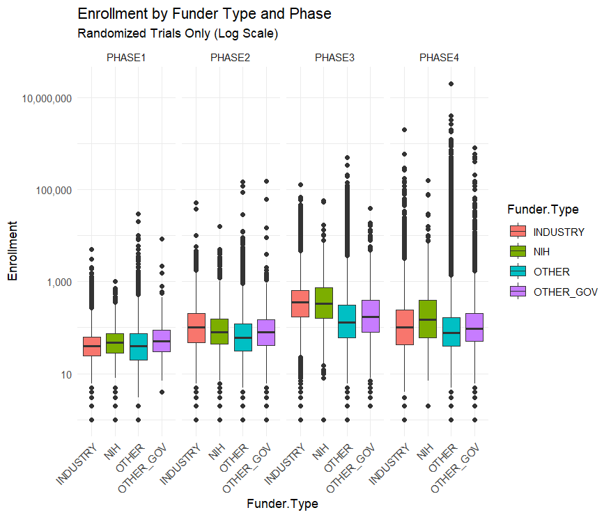
The NIH Doesn’t Fund Small Crappy Trials
A nice catch by Max at Maximum Progress:
[A common critique] is that the NIH funds too many “small crappy trials.” That quote is from a FDA higher up, but the story has been repeated by many others…I downloaded all of the clinical trial data from ClinicalTrials.gov to find out….The median NIH funded trial has 48 participants while the median industry funded trial has 67. The average NIH funded trial has 288 participants while the average industry trial has 335 and the average “Other” funded trial (mostly universities and the associated hospitals) has 923 participants.
By median or by average NIH trials are the smallest out of all the funders. This seems to confirm the “small crappy trials” narrative
…This narrative is reversed, however, when you split up the trials by phase.
Across all trials NIH funded ones are the smallest, but within each phase NIH trials are the largest or second largest. Their overall small enrollment average is just due to the fact that they fund more Phase I trials than Phase III. But NIH Phase I trials have a bigger sample size than industry funded trials on average.
This is an example of Simpson’s Paradox in the wild!
Arguing that the NIH should stop funding unusually small trials is easy but arguing that they should shift from funding the Phase I trials closest to basic research towards later stage trials is less clear.
The NIH’s clinical trial strategy is certainly not perfect and improving it is valuable. But a systematic bias towards “small crappy trials” doesn’t really seem like it’s an important problem facing the NIH.
GDP vs. individual consumption
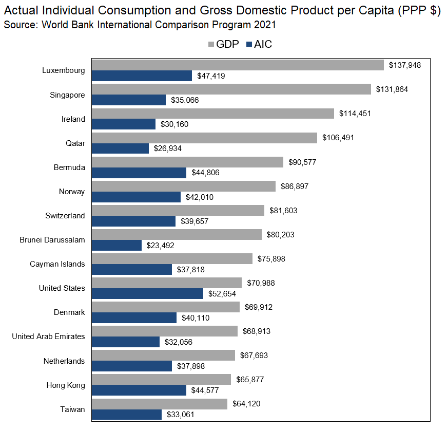
Here is the source tweet.
The partisanship of American inventors
Using panel data on 251,511 patent inventors matched with voter registration records containing partisan affiliation, we provide the first large-scale look into the partisanship of American inventors. We document that the modal inventor is Republican and that the partisan composition of inventors has changed in ways that are not reflective of partisan affiliation trends amongst the broader population. We then show that the partisan affiliation of inventors is associated with technological invention related to guns and climate change, two issue areas associated with partisan divide. These findings suggest that inventor partisanship may have implications for the direction of inventive activity.
Here is the full piece by Daniel Fehder, Florenta Teodoridis, Joseph Raffee, and Jino Lu. Via Kris Gulati.