Category: Data Source
“Gender without Children”
What would the lives of women look like if they knew from an early age that they would not have children? Would they make different choices about human capital or early career investments? Would they behave differently in the marriage market? Would they fare better in the labor market? In this paper, we follow 152 women diagnosed with the Mayer-Rokitanski-Kuster-Hauser (MRKH) type I syndrome. This congenital condition, diagnosed at puberty, is characterised by the absence of the uterus in otherwise phenotypically normal 46, XX females. Using granular health registries matched with administrative data from Sweden, we confirm that MRKH is not associated with worse health, nor with differential pre-diagnosis characteristics, and that it has a large negative impact on the probability to ever live with a child. Relative to women from the general population, women with the condition have better educational outcomes, tend to marry and divorce at the same rate, but mate with older men, and hold significantly more progressive beliefs regarding gender roles. The condition has also very large positive effects on earnings and employment. Dynamics reveal that most of this positive effect emerges around the arrival of children in women in the general population, with little difference before. We also find that women with MRKH perform as well as men in the labor market in the long run. Results confirm that “child penalties” on the labor market trajectories of women are large and persistent and that they explain the bulk of the remaining gender gap.
That is from recent work by Tatiana Pazem, with co-authors Camille Landais, Peter Lundberg, Erik Plug & Johan Vikstrom. Tatiana is on the job market from LSE, with her main job market paper being “Pension Reforms and Consumption in Retirement: Evidence from French Transactions and Bank Data.”
Does economics make you more sexist?
We provide direct evidence on explicit and implicit biases against women among students in economics relative to other fields. We conducted a large scale survey among undergraduates in Chile, among both entering first-year students and students in years 2 and above, combining a wide battery of measures to create an index of gender bias. Economics students are more biased than students in other fields. There is some evidence that economics students are more biased already upon entry, before exposure to economics classes. The gap becomes more pronounced among students in years 2 and above, especially for male students.
That is from a newly published paper by Valentina Paredes, M. Daniele Paserman, and Francisco J. Pino.
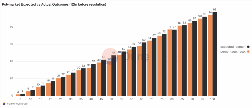
Prediction Markets Are Very Accurate
alexmccullough at Dune has a very good post on the accuracy of Polymarket prediction markets. First, how do we measure accuracy? Suppose a prediction market predicts an event will happen with p=.7, i.e. a 70% probability. The event happens. How do we score this prediction? A common method is the Brier Score which is the mean squared difference from the actual outcome. In this case the Brier Score is (0.70−1)2 = 0.09. Notice that if the prediction market had predicted the event would have happened with 90% probability, a better prediction, then the Brier Score would have been (0.90−1)2 = 0.01 a lower number. If the event had not happened then the Brier Score for a 70% prediction would have been (0.70−0)2 = 0.49, a higher number. Thus, a lower Brier Score is better.
Across some 90,000 predictions the Polymarket Brier Score for a 12 hour ahead prediction is .0581. As Alex notes:
A brier score below 0.125 is good, and below 0.1 is great. Polymarket’s total score is excellent, and puts it on par with the best prediction model’s in existence… Sports betting lines tend to average a brier score of between .18-.22.
Brier Scores have been widely used to measure weather forecasts. A state of the art 12 hour ahead forecast of rain, for example, might have a Brier Score of .0.05 – 0.12 so if Polymarket suggest a metaphorical umbrella you would be wise to listen.
Moreover, highly liquid markets are even more accurate.
Even markets with low liquidity have good brier scores below 0.1, but markets with more than $1m in total trading volume have scores of 0.0256 12 hours prior to resolution and 0.0159 a day prior. It’s hard to overstate how impressive that is.
There are, however, some small but systematic errors. The following bar chart splits events into 20 buckets of 5% each so the first bucket covers events that were predicted to happen 0-5% of the time and the last bucket covers events that were predicted to happen 95-100% of the time. The black bar gives the predicted probability, the orange bar the actual frequencies. As expected, events which are predicted to happen more often do happen more often with a very nice progression. Note, however, that the predicted probability is almost always slightly higher than the actual frequency. This means that people are paying a bit too much. It’s unclear whether this is due to market design issues such as the greater difficult of shorting or something about the Automated Market Makers or due to psychological factors such as favorite bias. Thus, some room for improvement but very impressive overall.
Understanding and Addressing Temperature Impacts on Mortality
Here are some important results:
A large literature documents how ambient temperature affects human mortality. Using decades of detailed data from 30 countries, we revisit and synthesize key findings from this literature. We confirm that ambient temperature is among the largest external threats to human health, and is responsible for a remarkable 5-12% of total deaths across countries in our sample, or hundreds of thousands of deaths per year in both the U.S. and EU. In all contexts we consider, cold kills more than heat, though the temperature of minimum risk rises with age, making younger individuals more vulnerable to heat and older individuals more vulnerable to cold. We find evidence for adaptation to the local climate, with hotter places experiencing somewhat lower risk at higher temperatures, but still more overall mortality from heat due to more frequent exposure. Within countries, higher income is not associated with uniformly lower vulnerability to ambient temperature, and the overall burden of mortality from ambient temperature is not falling over time. Finally, we systematically summarize the limited set of studies that rigorously evaluate interventions that can reduce the impact of heat and cold on health. We find that many proposed and implemented policy interventions lack empirical support and do not target temperature exposures that generate the highest health burden, and that some of the most beneficial interventions for reducing the health impacts of cold or heat have little explicit to do with climate.
Those are from a recent paper by Marshall Burke, et.al.
The Economic Geography of American Slavery
What would the antebellum American economy have looked like without slavery? Using new micro-data on the U.S. economy in 1860, we document that where free and enslaved workers live and how much they earn correlates strongly—but differently—with geographic proxies for agricultural productivity, disease, and ease of slave escape. To explain these patterns, we build a quantitative spatial model of slavery, where slaveholders coerce enslaved workers into supplying more labor, capture the proceeds of their labor, and assign them to sectors and occupations that maximize owner profits rather than worker welfare. Combining theory and data, we then quantify how dismantling the institution of slavery affected the spatial economy. We find that the economic impacts of emancipation are substantial, generating welfare gains for the enslaved of roughly 1,200%, while reducing welfare of free workers by 0.7% and eliminating slaveholder profit. Aggregate GDP rises by 9.1%, with a contraction in agricultural productivity counteracted by an expansion in manufacturing and services driven by an exodus of formerly enslaved workers out of agriculture and into the U.S. North.
That is from a new NBER working paper by
How Immigration is Changing the Black-White Earnings Gap
We provide new evidence on earnings gaps between non-Hispanic White and three generations of Black workers in the United States during 1995-2024, using nationally representative data. Results reveal remarkable earnings advances among 2nd-generation Black immigrants, opposite to the well-documented widening in overall Black-White earnings gap. Among women, 2nd-generation Black workers have earnings higher than or equal to White women; among men, they earn 10% less at the median, but the gap vanishes at the top decile. The gap for 1st-generation Black men is shrinking, halving at the top decile; for 1st-generation Black women it shows initial widening then shrinking at the median. The native Black-White gap remains stubbornly high. Educational attainment largely drives 2nd-generation success, while residential patterns play a protective role for the 1st and 2nd generations. These findings provide critical data to set the record straight on the accomplishments of the highly successful and rising demography of Black immigrants and their US-born children.
That is from a new NBER working paper by Rong Fu, Neeraj Kaushal, and Felix Muchomba.
Hanson and Buterin for Nobel Prize in Economics
Intercontinental Exchange (ICE.N), the company that owns the NYSE exchange, just announced a $2 billion dollar investment in Polymarket, the Ethereum-blockchain based prediction markets platform. This is a tremendous milestone for prediction markets and for blockchains.
Shayne Coplan the founder of Polymarket writes:
The Polymarket origin story is funny because it’s a rare case of the dream being identical to how things played out. If I learned one thing, it’s that bold ideas are everywhere, hidden in plain sight. It just takes someone crazy enough to spend their life willing it into existence. That’s entrepreneurship: willing things into existence.
I remember reading Robin Hanson’s literature on prediction markets and thinking – man, this is too good of an idea to just exist in whitepapers. There were a million reasons why it shouldn’t work, countless arguments of why not to do it, and the odds were against us, but we had to try.
At the onset of the pandemic, I quite literally had nothing to lose: 21, running out of money, 2.5 years since I dropped out and nothing to show for it. But I knew we were entering an era where ways to find truth would matter more than ever, and Polymarket could play a critical role in that. After all, nothing is more valuable than the truth. It’s still a work in progress, but we’re honored to have made the impact we have thus far.
The NYSE will use Polymarket data to sharpen forecasts. The next step is decision markets. Futarchy, for example, just announced a prediction market in the value of Tesla shares if Musk’s compensation package is approved versus if it is not approved. Information like this can be used to improve decisions. To see how powerful this can be, broaden it to Hanson’s 1996 idea of a Dump the CEO Market, a market in the value of a company’s shares with and without the current CEO. Very powerful. And that is only the beginning.
In my 2002 book, Entrepreneurial Economics: Bright Ideas from the Dismal Science, which featured Robin’s paper on Decision Markets, I wrote
If Hanson is right about the benefits of decision markets, then perhaps one day, instead of quoting an expert, the New York Times editorial section will refer to the latest quote on “health care plan A” available in the business pages.
That day is upon us! It probably will not happen on Monday but it is time to give Robin Hanson, the father of prediction markets, and Vitalik Buterin, the co-father of Ethereum, a Nobel prize in economics for applied mechanism design.
Addendum: My a16z podcast with Scott Duke Kominers on prediction markets.
Claims about polygyny
The title of this piece is “High rates of polygyny do not lock large proportions of men out of the marriage market.” I believe further investigation is warranted before drawing such conclusions, but here is the abstract:
Social scientists often assume that when men can marry multiple wives (polygyny), many other men will be unable to marry. Versions of this assumption feature prominently in theories of civil war, the evolution of monogamy, and the incel movement. Using census data from 30 countries across Africa, Asia, and Oceania, as well as data from the historical United States, we find no clear evidence that polygyny is associated with higher proportions of unmarried men in society. Instead, high-polygyny populations often have marriage markets skewed in favor of men, and actually, men in high-polygyny populations usually marry more than men in low-polygyny ones. These findings challenge entrenched assumptions and inform debates on marriage systems, societal stability, and human rights.
That is from a recent paper by Hampton Gaddy, Rebecca Sear, and Laura Fortunato. At the very least, you hear the contrary story so often, and without firm documentation, that it is worth shaking the debate here a little bit.
Share repurchases do not discourage investment
Theory tells us that, and the empirics tell us that too:
Our study examines the claim that share repurchases lead to reductions in real investments. Repurchase opponents argue that managers forego valuable investments to conduct opportunistic repurchases, while proponents argue that repurchases return excess cash to shareholders. We compare repurchasing firms’ real investments in capital expenditures, R&D, and employment to public and private non-repurchasing firms—holding constant their growth (i.e., investment) opportunity sets. Our results provide no support for the claim that repurchases lead to lower real investments. Consistent with these findings, we also show that financial analysts do not revise downward their capital expenditure forecasts following repurchases.
That is from a recent paper by Paul Brockman, Hye Seung (Grace) Lee, and Jesus M. Salas. You see the opposing argument in the media all the time, but it is wrong, wrong, wrong. As in “not correct.”
Via the excellent Kevin Lewis.
Singapore fact of the day
For every Singaporean who has left Christianity, about three others have become Christians.
About 3.2 in fact, if you look at the exact numbers. Buddhism in Japan and South Korea is being depopulated, also. Here is the Pew piece on defections from religions.
Who exactly is rigid again?
In an adversarial collaboration, two preregistered U.S.-based studies (total N = 6181) tested three hypotheses regarding the relationship between political ideology and belief rigidity (operationalized as less evidence-based belief updating): rigidity-of-the-right, symmetry, and rigidity-of-extremes. Across both studies, general and social conservatism were weakly associated with rigidity (|b| ~ .05), and conservatives were more rigid than liberals (Cohen’s d ~ .05). Rigidity generally had null associations with economic conservatism, as well as social and economic political attitudes. Moreover, general extremism (but neither social nor economic extremism) predicted rigidity in Study 1, and all three extremism measures predicted rigidity in Study 2 (average |bs| ~ .07). Extreme rightists were more rigid than extreme leftists in 60% of the significant quadratic relationships. Given these very small and semi-consistent effects, broad claims about strong associations between ideology and belief updating are likely unwarranted. Rather, psychologists should turn their focus to examining the contexts where ideology strongly correlates with rigidity.
That is from a new piece by Shauna M. Bowes, Cory J. Clark, Lucian Gideon Conway III, Thomas Costello, Danny Osborne, Philip E. Tetlock, and Jan-Willem van Prooijen. Via the excellent Kevin Lewis.
AI Scientists in the Lab
Today, we introduce Periodic Labs. Our goal is to create an AI scientist.
Science works by conjecturing how the world might be, running experiments, and learning from the results.
Intelligence is necessary, but not sufficient. New knowledge is created when ideas are found to be consistent with reality. And so, at Periodic, we are building AI scientists and the autonomous laboratories for them to operate.
…Autonomous labs are central to our strategy. They provide huge amounts of high-quality data (each experiment can produce GBs of data!) that exists nowhere else. They generate valuable negative results which are seldom published. But most importantly, they give our AI scientists the tools to act.
…One of our goals is to discover superconductors that work at higher temperatures than today’s materials. Significant advances could help us create next-generation transportation and build power grids with minimal losses. But this is just one example — if we can automate materials design, we have the potential to accelerate Moore’s Law, space travel, and nuclear fusion.
Our founding team co-created ChatGPT, DeepMind’s GNoME, OpenAI’s Operator (now Agent), the neural attention mechanism, MatterGen; have scaled autonomous physics labs; and have contributed to important materials discoveries of the last decade. We’ve come together to scale up and reimagine how science is done.
The AI’s can work 24 hours a day, 365 days a year and with labs under their control the feedback will be quick. In nine hours, AlphaZero taught itself chess and then trounced the then world champion Stockfish 8, (ELO around 3378 compared to Magnus Carlsen’s high of 2882). That was in 2017. In general, experiments are more open-ended than chess but not necessarily in every domain. Moreover context windows and capabilities have grown tremendously since 2017.
In other AI news, AI can be used to generate dangerous proteins like ricin and current safeguards are not very effective:
Microsoft bioengineer Bruce Wittmann normally uses artificial intelligence (AI) to design proteins that could help fight disease or grow food. But last year, he used AI tools like a would-be bioterrorist: creating digital blueprints for proteins that could mimic deadly poisons and toxins such as ricin, botulinum, and Shiga.
Wittmann and his Microsoft colleagues wanted to know what would happen if they ordered the DNA sequences that code for these proteins from companies that synthesize nucleic acids. Borrowing a military term, the researchers called it a “red team” exercise, looking for weaknesses in biosecurity practices in the protein engineering pipeline.
The effort grew into a collaboration with many biosecurity experts, and according to their new paper, published today in Science, one key guardrail failed. DNA vendors typically use screening software to flag sequences that might be used to cause harm. But the researchers report that this software failed to catch many of their AI-designed genes—one tool missed more than 75% of the potential toxins.
Solve for the equilibrium?
New data on social media
It has gone largely unnoticed that time spent on social media peaked in 2022 and has since gone into steady decline, according to an analysis of the online habits of 250,000 adults in more than 50 countries carried out for the FT by the digital audience insights company GWI. And this is not just the unwinding of a bump in screen time during pandemic lockdowns — usage has traced a smooth curve up and down over the past decade-plus.
Across the developed world, adults aged 16 and older spent an average of two hours and 20 minutes per day on social platforms at the end of 2024, down by almost 10 per cent since 2022. Notably, the decline is most pronounced among the erstwhile heaviest users — teens and 20-somethings…
Additional data from GWI trace the shift. The shares of people who report using social platforms to stay in touch with their friends, express themselves or meet new people have fallen by more than a quarter since 2014. Meanwhile, reflexively opening the apps to fill up spare time has risen, reflecting a broader pernicious shift from mindful to mindless browsing.
Here is more from John Burn-Murdoch in the FT. I was just doing as Aspen podcast two nights ago, where I spoke of social media as a problem that, in time, largely would solve itself. You also may recall my recent post about declining rates of depression for young adults. That said, you might wonder what exactly is the correct definition of social media (MR comments section?), and whether this study is tracking the proper conception of it.
For the pointer I thank Adrian Kelly.
Mark Skousen on recession warning signs
The White House and Wall Street were exuberant last week when the Commerce Department’s Bureau of Economic Analysis revised upward its second-quarter estimate of gross domestic product to show 3.8% growth in real terms, compared with a negative number in the first quarter. “US economy notches fastest growth pace in nearly two years in second quarter,” reported Yahoo Finance, “suggesting robust growth despite uncertainty set off by President Donald Trump’s tariff policy.”
Dig into the numbers, however, and you find the trade war is in fact wreaking economic havoc. Buried in last week’s BEA report is a much more reliable measure of the economy—gross output, or GO. It measures spending at all stages of production, totaling an estimated $63 trillion this year—more than twice GDP of $30 trillion.
GO revealed that economic growth is slowing to a crawl, ahead only 1.2% in real terms. If you include all transactions in wholesale and retail trade, the adjusted GO is up only 0.3%. More important, overall business spending fell sharply, by an annualized 5.6% in real terms. These results are much more consistent with the weak labor-market data.
Here is more from the WSJ.
Innovation and the Great Divergence
Abstract: Recent developments in historical national accounting suggest that the timing of the Great Divergence hinges on the different trends in northwest Europe and the Yangzi Delta region of China. The positive trend of GDP per capita in northwest Europe after 1700 was a continuation of a process that began in the fourteenth century, while the negative trend in the Yangzi Delta continued a pattern of alternating periods of growing and shrinking, but reaching a new lower level. These GDP per capita trends were driven by different paths of innovation. TFP growth was strongly positive in Britain after the Black Death, in the Netherlands during the sixteenth century and again in Britain from the mid-seventeenth century. Although TFP growth was positive in China during the Northern Song dynasty, it was predominantly negative during the Ming and Qing dynasties, in the Yangzi Delta as well as in China as a whole.
By Stephen Broadberry and Runzhuo Zhai, via the excellent Samir Varma.