The economic value of a law degree
Michael Simkovic and Frank McIntyre have a new paper on this topic:
Legal academics and journalists have marshaled statistics purporting to show that enrolling in law school is irrational. We investigate the economic value of a law degree and find the opposite: given current tuition levels, the median and even 25th percentile annual earnings premiums justify enrollment. For most law school graduates, the present value of a law degree typically exceeds its cost by hundreds of thousands of dollars. We improve upon previous studies by tracking lifetime earnings of a large sample of law degree holders. Previous studies focused on starting salaries, generic professional degree holders, or the subset of law degree holders who practice law. We also include unemployment and disability risk rather than assume continuous full time employment. After controlling for observable ability sorting, we find that a law degree is associated with a 73 percent median increase in monthly earnings and 60 percent increase in median hourly wages. The mean annual earnings premium of a law degree is approximately $57,200 in 2013 dollars. The law degree earnings premium is cyclical and recent years are within historical norms. We estimate the mean pre-tax lifetime value of a law degree as approximately $1,000,000.
For the pointer I thank the excellent Andres Marroquin.
Global austerity?
There is a new UBS study which among other things covers the fiscal stance of the world as a whole. Please do not misinterpret me as suggesting this implies anything particular for the policy of any individual nation, still the aggregate numbers are interesting to ponder. Here is part of an FTAlphaville summary:
- Government consumption’s share of global GDP has risen from 11 per cent to 14 per cent over the past 15 years. In 2013, it hit its highest level since 1980.
- At the same time, government debt-to-GDP ratios have hit record highs in many countries.
- Working-age populations are growing more slowly, or in some countries, such as Japan, beginning to decline.
- Accordingly, the window of opportunity for mature economies to bring government debt levels down to sustainable levels is narrowing, owing to demographic shifts.
- Given the situation in the government sector, private consumption needs to make a bigger contribution to the next phase of the recovery. Its share of GDP continues to hit multi-decade lows. Fixed investment is also making a smaller contribution to global growth than it did in the pre-crisis years.
And this:
Since the start of 2008, government consumption at the global level has risen by 20 per cent in real terms, whereas private consumption and fixed investment have risen just 8 per cent and 5 per cent respectively. Despite talk of austerity, government spending continues to run ahead of spending in the private sector.
While I have not looked into this particular estimate, China is likely playing a big role in this effect.
Hugo Lindgren asked me to explain to him why I think Los Angeles is the best city in the world
I wrote this email, which in the interests of varying the “voice” on this blog I have not in the meantime edited:
Best food in the US, no real comparison especially adjusting for price.
Best driving for classic routes and views and also availability of parking along the way (NYC is awful for the latter).
Best walking city in the US (really), and year round.
The city has its own excellent musical soundtrack, Beach Boys, Byrds, Nilsson, etc., has aged better than the SF groups I think.
Incredible architecture and neighborhoods, almost everywhere.
Everyone goes to the movies.
First-rate concert life, including classical and contemporary classical.
Very interesting art galleries.
Few book stores (though disappearing everywhere, these days) and the people have no real sense of humor, but nowhere is perfect!
Claims about coal
Counterfactual estimates of city population sizes indicate that our estimated coal effect explains at least 60% of the growth in European city populations from 1750 to 19o0.
That is from a new NBER working paper by Alan Fernihough and Kevin Kevin Hjortshøj O’Rourke. There is an ungated version of the paper here.
Assorted links
The North Carolina unemployment insurance experiment may be looking up
The benefits have been stopped, and there has been much recent debate over how well this is working to stimulate reemployment. This new study is from Kurt Mitman, who is a doctoral candidate at U. Penn and an NBER research associate, here is his summary:
1. Evidence from the establishment survey confirms a substantial increase in employment in North Carolina following the unemployment insurance reform.
2. The increase in payroll employment reported by the sample of North Carolina employers is smaller than the increase in employment reported by workers in the household survey.
3. The increase in employment [is] driven by the private service sector.
4. A comparison of the growth in employment between North Carolina and the adjacent states in Figure 5 reveals a similar growth in the post-reform period between the two Carolinas, which is much faster growth than in Virginia.
5. Results in Table 3 reveal a mild tendency toward higher weekly hours post reform and little change in wages and earnings.
The full piece is here (pdf). This seems to me our best understanding of the admittedly limited data to date.
Upward mobility in the United States is not declining as many citizens think
Here is the new Raj Chetty paper that everyone is talking about (pdf);
We use administrative records on the incomes of more than 40 million children and their parents to describe three features of intergenerational mobility in the United States. First, we characterize the joint distribution of parent and child income at the national level. The conditional expectation of child income given parent income is linear in percentile ranks. On average, a 10 percentile increase in parent income is associated with a 3.4 percentile increase in a child’s income. Second, intergenerational mobility varies substantially across areas within the U.S. For example, the probability that a child reaches the top quintile of the national income distribution starting from a family in the bottom quintile is 4.4% in Charlotte but 12.9% in San Jose. Third, we explore the factors correlated with upward mobility. High mobility areas have (1) less residential segregation, (2) less income inequality, (3) better primary schools, (4) greater social capital, and (5) greater family stability. While our descriptive analysis does not identify the causal mechanisms that determine upward mobility, the new publicly available statistics on intergenerational mobility by area developed here can facilitate future research on such mechanisms.
Here is summary coverage from David Leonhardt. The highly reliable David starts with this: “The odds of moving up — or down — the income ladder in the United States have not changed appreciably in the last 20 years, according to a large new academic study that contradicts politicians in both parties who have claimed that income mobility is falling.”
Confusing issues of equality and mobility remains rife in current discourse.
Income inequality is not as extreme as many citizens think
Here is a recent Gallup poll of interest, suggesting many people are unhappy with the level of income inequality. Alternatively, here is a new paper to warm Bryan Caplan’s heart, by John R. Chambers, Lawton K. Swan, and Martin Heesacker, entitled “Better Off Than We Know: Distorted Perceptions of Incomes and Income Inequality in America”:
Three studies examined Americans’ perceptions of incomes and income inequality using a variety of criterion measures. Contrary to recent findings indicating that Americans underestimate wealth inequality, we found that Americans not only overestimated the rise of income inequality over time, but also underestimated average incomes. Thus, economic conditions in America are more favorable than people seem to realize. Furthermore, ideological differences emerged in two of these studies, such that political liberals overestimated the rise of inequality more than political conservatives. Implications of these findings for public policy debates and ideological disagreements are discussed.
There is this bit:
Most participants (76%) incorrectly selected the higher value ($681,649) as the cutoff for the top 1% of earners, magnifying the level of income it takes to qualify as a “1 percenter.”
There are different measures, but I think of 380k as the relevant cut-off point for the top one percent. Here is a useful Atlantic write-up of the piece. I cannot find an ungated version, can you?
I thank Veronique de Rugy and Scott Winship for relevant pointers.
The home bias in sovereign ratings
There is a new and intriguing paper on this topic, by Andreas Fuchs and Kai Gehring, the abstract is this:
Credit rating agencies are frequently criticized for producing sovereign ratings that do not accurately reflect the economic and political fundamentals of rated countries. This article discusses how the home country of rating agencies could affect rating decisions as a result of political economy influences and culture. Using data from nine agencies based in six countries, we investigate empirically if there is systematic evidence for a home bias in sovereign ratings. Specifically, we use dyadic panel data to test whether, all else being equal, agencies assign better ratings to their home countries, as well as to countries economically, politically and culturally aligned with them.
While most of the variation in ratings is explained by the fundamentals of rated countries, our results provide empirical support for the existence of a home bias in sovereign ratings. We find that the bias becomes more accentuated following the onset of the Global Financial Crisis and appears to be driven by economic and cultural ties, not geopolitics.
The paper has been covered by FT Alphaville, by China Daily, and by Der Spiegel (in German).
Neumark and Wascher on minimum wages and youth unemployment
Here is the abstract from their piece from 2003 (pdf):
We estimate the employment effects of changes in national minimum wages using a pooled cross-section time-series data set comprising 17 OECD countries for the period 1975-2000, focusing on the impact of cross-country differences in minimum wage systems and in other labor market institutions and policies that may either offset or amplify the effects of minimum wages. The average minimum wage effects we estimate using this sample are consistent with the view that minimum wages cause employment losses among youths. However, the evidence also suggests that the employment effects of minimum wages vary considerably across countries. In particular, disemployment effects of minimum wages appear to be smaller in countries that have subminimum wage provisions for youths. Regarding other labor market policies and institutions, we find that more restrictive labor standards and higher union coverage strengthen the disemployment effects of minimum wages, while employment protection laws and active labor market policies designed to bring unemployed individuals into the work force help to offset these effects. Overall, the disemployment effects of minimum wages are strongest in the countries with the least regulated labor markets.
Argentina tries to stave off a continuing financial crisis
Argentina has introduced new restrictions on online shopping as part of efforts to stop foreign currency reserves from falling any further.
…Items imported through websites such as Amazon and eBay are no longer delivered to people’s home addresses. The parcels need to be collected from the customs office.
Believe it or not, there is several hours wait at the customs office. There is more here, via Counterparties.
Assorted links
1. Explaining how the Mini-Med plans are possible under ACA.
2 The absence of net neutrality in some developing economies.
3. Rizwan Muazzam Qawwali (video, intense).
4. Volokh Conspiracy will join The Washington Post. And a few articles on Ezra Klein and all that stuff, here and here and here and Krugman here.
5. What is on the horizon for ACA? Read especially the second part of the post on potential crises to come.
6. Dube on the minimum wage and poverty.
7. Good update on North Carolina and unemployment insurance, good graphs too.
How Many Homicides were there in 2010?
How many homicides were there in 2010 in the United States? Well, that’s easy. Let’s just do some Googling:
Between the smallest and largest figures there is a difference of 3,292 deaths or 25%!
The differences are striking but not entirely arbitrary or without explanation. I assume the second figure adds late additions to the 2010 data and so should be considered more authoritative but that is a relatively small difference.
The difference between 2 and 3 is puzzling and seems to be that the number in 2 is drawn from the Supplementary Homicide Report (SHR) statistics on victims while the larger figure is drawn from homicide reports in the UCR. Not all agencies collect the more detailed statistics in the SHR while the UCR is nearly complete. Thus the victim figure is smaller than the report figure (this doesn’t appear to conform exactly to where the data is supposed to be sourced but it’s what the FBI tells me). It’s unclear why the FBI would report both figures when they know one is misleading.
The difference between 3 and 4 comes from different definitions of homicide. The FBI collects data on crimes. If a killing is ruled justified, i.e. not a crime, it doesn’t go into the FBI homicide statistics. The CDC collects data from death certificates which list as homicide any death caused by “injuries inflicted by another person with intent to injure or kill, by any means.” Thus, the CDC data includes justifiable homicide. In 2010 according to the FBI there were 387 justifiable homicides by law enforcement and 278 by private citizen for a total of 665 justifiable homicides, so that accounts for some but not all of the difference.
(By the way, the 278 justifiable homicides in 2010 by private citizens compared to 387 by law enforcement and 14,720 unjustifiable homicides would seem to be an important context for many claims about stand your ground laws. N.b. this doesn’t mean that the laws couldn’t be associated with more unjustifiable homicides).
The FBI (3) and NVSS (4) figures track each other closely over time but its important to be aware of the differences and to be consistent in one’s calculations.
Which kinds of music are encouraged by streaming vs. downloads?
Let’s compare iTunes downloads to a mythical perfect streaming service which lets you listen to everything for a fixed fee each month or sometimes even for free. In the interests of analytical clarity, I will oversimplify some of the actual pricing schemes associated with streaming and consider them in their purest form.
Streaming seems to encourage the demand for variety, so the website vendor wants to make browsing seem really fun, perhaps more fun than the songs themselves. (An alternative view is that the information produced by streaming services, and the recommendations, allow for in-depth exploration of genres and that outweighs the “greater ease of sampling of variety” effect. Perhaps both effects can be true for varying groups of listeners with somehow the “middle level of variety-seeking left in the lurch, relatively speaking.)
The music creators are incentivized to create music which sounds very good on first approach. Otherwise the listener just moves on to further browsing and doesn’t think about going to your concert or buying your album.
Streaming, with its extremely large menu, also means commonly consumed pieces will tend to be shorter or more easily broken into excerpts. This will favor pop music and I think also opera, because of its arias.
Advertising is a more important revenue source for streaming than it is for downloads. The music promoted by streaming services thus should contribute to the overall ambience and coolness of the site, and musicians who can meet that demand will find that their work is given more upfront attention. It encourages music whose description evokes a response of “Oh, I’ve never had that before, I’d like to try it.” Even if you don’t really care about it.
People who purchase advertised products are, on average, older than the people who purchase music. Streaming services thus should slant product and product accessibility on the site toward the musical tastes of older people.
Since streaming divides up revenues among a greater number of artists, that should encourage solo performers with low capital costs, who can keep their (tiny) share all for themselves. It also may require that the artists on streaming services can make a living or partial living giving concerts, even more so than under the previous world order.
This music industry source suggests that streaming boosts album sales in a way that downloads do not. It also questions whether that boost will be long-lived, as streaming services take over more of the market.
When the marginal cost of more music is truly zero, does that make musical choices more or less socially influenced?
Hannah Karp shows that in the new world of streaming, mainstream radio stations are responding by playing the biggest hits over and over again. Ad-supported media require the familiar song to grab and keep the attention of the listener. Risk-aversion is increasing, which probably pushes some marginal listeners, who are interested in at least some degree of exploration, into further reliance on streaming.
The top 10 songs last year were played close to twice as much on the radio than they were 10 years ago, according to Mediabase, a division of Clear Channel Communications Inc. that tracks radio spins for all broadcasters. The most-played song last year, Robin Thicke’s “Blurred Lines,” aired 749,633 times in the 180 markets monitored by Mediabase. That is 2,053 times a day on average. The top song in 2003, “When I’m Gone” by 3 Doors Down, was played 442,160 times that year.
So the differing parts of the market are interdependent here.
What do you think?
Traffic Forecasts
Official DOT forecasts of road traffic with actual road traffic.
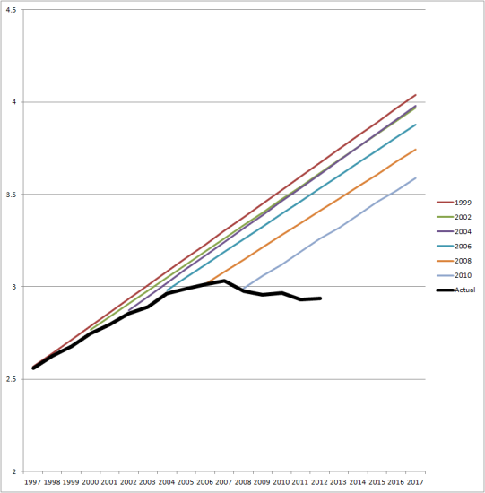
Hat tip to Andrew Gelman, who compares it with some other famous forecasts.