Category: Data Source
China Fact of the Day
In the course of making the case that China’s property bubble is popping the FT notes:
In just two years, from 2011 to 2012, China produced more cement than the US did in the entire 20th century, according to historical data from the US Geological Survey and China’s National Bureau of Statistics.
Can you trust Chinese government statistics?
Political scientist Jeremy Wallace has a recent paper on this topic:
Economic statistics dominate policy analyses, political discussions, and the study of political economy. Such statistics inform citizens on general conditions while central leaders also use them to evaluate local officials. Are economic data systematically manipulated? After establishing discrepancies in economic data series across regime types cross-nationally, I dive into sub-national growth data in China. This paper leverages variation in the likelihood of manipulation over two dimensions, arguing that politically sensitive data are more likely to be manipulated at politically sensitive times. GDP releases generate headlines, while highly correlated electricity production and consumption data are less closely watched. At the sub-national level in China, the difference between GDP and electricity growth increases in years with leadership turnover, consistent with juking the stats for political reasons. The analysis points to the political role of information and the limits of non-electoral accountability mechanisms in authoritarian regimes as well as suggesting caution in the use of politically sensitive official economic statistics.
All good points. I would stress, however, that Chinese statistics have many problems in them and so they are not simple overestimates of how the economy is doing, at least not over the last thirty years as a whole. In some ways Chinese growth statistics have been, until 2008-2009, probably underestimating the actual progress on the ground. In general, growth figures underestimate progress when changes are large, and overestimate progress when changes are small. (One reason for this is that extreme progress brings a lot of new goods to the market and their marginal value is underestimated by their price ex post, since it is hard to adjust for the fact that the price ex ante was infinite or very high.) In Western history for instance, our most significant period of growth was probably the late 19th through early 20th century, when the foundations for the modern world were laid, yet estimated growth rates for this period are not astonishingly high. We’re missing out on the values of the new goods, for one thing.
For the pointer I thank Henry Farrell.
Dynamic effects of microcredit in Bangladesh
By Khandker and Samad, there is now a new study of microcredit and it has a much longer time horizon — twenty years — than the previous “gold standard” studies. It also finds more positive effects than many of the other treatments:
This paper uses long panel survey data spanning over 20 years to study the effects of microcredit programs in Bangladesh. It uses a dynamic panel model to address a number of issues, such as whether credit effects are declining over time, whether market saturation and village diseconomies are taking place, and whether multiple program membership, which is rising as a consequence of microcredit expansion, is harming or benefiting the borrowers. The paper makes the following observations:
- Group-based credit programs have significant positive effects in raising household welfare including per capita consumption, household non-land assets and net worth;
- Microfinance increases income and expenditure, the labor supply of males and females, non-land asset and net worth as well as boys’ and girls’ schooling;
- Microfinance, especially female credit, reduces poverty;
- Past credit has a higher impact on income and expenditure than current credit;
- With higher village-level aggregate current male borrowing, the marginal effect of male borrowing on per capita income gets lower.
The paper concludes that the current microfinance policy of credit expansion alone may not be enough to boost income and productivity, and, hence, sustained poverty reduction.
There is a useful write-up of the paper from The Economist. In sum, we should up our estimate of the efficacy of microcredit.
Chinese wheat eaters vs. rice eaters (speculative)
Angela Meng reports:
Researchers have found that people from rice-growing southern China are more interdependent and holistic thinkers, while those from the wheat-growing north are more independent and analytical.
The researchers call it “rice theory”, and they believe the psychological differences of southern and northern Chinese stem from their ancestors’ subsistence techniques – rice farming needs co-operation and planning; wheat farming requires less co-operation between neighbours.
…The last experiment assessed the nepotism, or group loyalty, of the participants. Students were given hypothetical scenarios and asked how they would treat friends and strangers in reaction to helpful or harmful actions. A defining characteristic of holistic culture is that people draw sharp contrasts between friend and stranger.
“The data suggests that legacies of farming are continuing to affect people,” Thomas Talhelm, of the University of Virginia and lead author of the research, said. “It has resulted in two distinct cultural psychologies that mirror the differences between East Asia and the West.”
Talhelm and his team concluded that the co-operative nature of rice-growing has cultivated a culture of interdependence, while wheat-growing has cultivated independence.
“I think the rice theory provides some insight to why the rice-growing regions of East Asia are less individualistic than the Western world or northern China, even with their wealth and modernisation,” Talhelm said.
Here is Talhelm’s home page. Research summaries are here (interesting). Links to his research are here, and the wheat paper is here.
For the pointer I thank the excellent Mark Thorson.
The Piketty Bubble?
Piketty’s Capital is not very clear on how to distinguish greater physical capital from higher asset prices. For the most part, Piketty discusses capital as something that builds up over time through savings. The increase in physical capital then generates large returns to rentiers and those returns increases the capital share of income. When it comes to measuring capital, however, this has to be done in money terms which means that we need the price of capital. But the price of capital can vary significantly; as a result, Piketty’s capital stock can vary significantly even without changes in physical capital or savings. When capital increases because of changes in its price, however, the implications are quite different from a physical increase in capital.
Consider an asset that pays a dividend D forever; at interest rate r the asset is worth P=D/r. As r falls, the price of the asset rises. An asset that pays $100 forever is worth $1000 at an interest rate of 10% (.1) but $2000 at an interest rate of 5%. Piketty measures a higher P as more capital but notice that P is high only because r is low. You can’t, therefore, multiply P by some fixed r and conclude that rents have increased. Indeed, in this case rents, the dividend, haven’t increased at all. For the most part, Piketty simply ignores this issue (at least in the book) by arguing that changes in the price of capital wash out over long time periods but that does not appear to be the case in his data.
According to four French economists, Piketty’s measure of the capital stock is greatly influenced by the Europe-US housing bubble that preceded the financial crisis (Tyler earlier pointed to the French version of this paper, this is the English version). Since Piketty’s theory is based on rents from physical capital, the authors suggest that measures of housing capital based on prices should be corrected using the rent to price ratio. In other words, if the rentiers aren’t getting more rents then their capital hasn’t really increased. When measured in this way, the authors find little to no increase in the capital stock in either France or the United States.
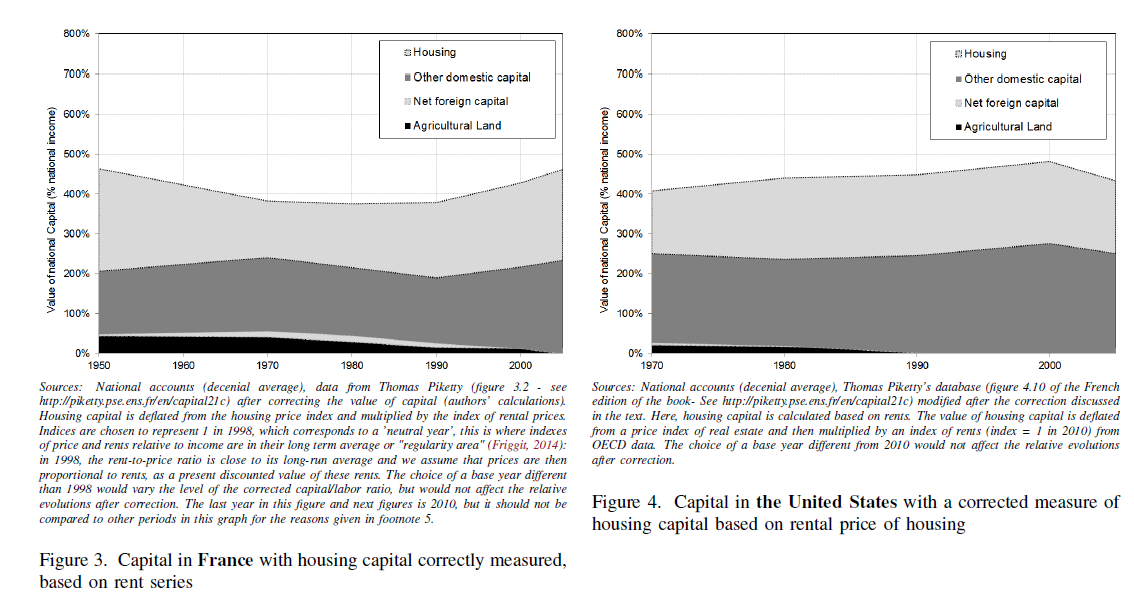
Addendum: Do note that the debate here is not about income inequality but rather the source of income inequality and the implications for the future that Piketty draws from a (possibly not) rising capital stock.
How many World Bank reports are downloaded or cited at all?
About 13 percent of policy reports were downloaded at least 250 times while more than 31 percent of policy reports are never downloaded. Almost 87 percent of policy reports were never cited. More expensive, complex, multi-sector, core diagnostics reports on middle-income countries with larger populations tend to be downloaded more frequently. Multi-sector reports also tend to be cited more frequently. Internal knowledge sharing matters as cross support provided by the World Bank’s Research Department consistently increases downloads and citations.
By the way, about 49 percent of these reports have the stated objective of informing the public debate. There is more here, from the World Bank itself, by Doerte Doemeland and James Trevino.
A prediction: from MR alone, this will be one of the Bank’s most widely downloaded reports.
Hat tip goes to Justin Sandefur.
Cornwall and Wales under purchasing power parity (British average is over)
The grim truth about pay and living standards in some the regions of the UK has also been highlighted by official EU figures showing that parts of Britain are effectively poorer that countries from former communist countries in Eastern Europe.
People in Cornwall and the Welsh Valleys are worse off than residents of Estonia and Lithuania, according to Eurostat figures comparing wealth across the EU using a measure known as “purchasing power standards” – which takes into account GDP per person and cost of living.
In addition, Durham and the Tees Valley, in the north east of England, are poorer than those in the wealthiest regions of Bulgaria and Romania, the two most deprived countries in the EU.
By contrast, the Eurostat figures show that London is the richest place in Europe.
There is more here.
Is Brooklyn getting poorer?
At the median, yes, according to Daniel Kay Hertz:
I recently ran across a post from data-crunching blog extraordinaire Xenocrypt, which noted that from 1999 to 2011, median household income in Brooklyn fell from $42,852 to $42,752…
Furthermore in large parts of Brooklyn real estate prices are falling. You can read more here, with interesting pictures.
The pointer is from Hugo Lindgren.
Profiting from Machine Learning in the NBA Draft
There is a new paper by Philip Maymin:
I project historical NCAA college basketball performance to subsequent NBA performance for prospects using modern machine learning techniques without snooping bias. I find that the projections would have helped improve the drafting decisions of virtually every team: over the past ten years, teams forfeited an average of about $90,000,000 in lost productivity that could have been theirs had they followed the recommendations of the model. I provide team-by-team breakdowns of who should have been drafted instead, as well as team summaries of lost profit, and draft order comparison. Far from being just another input in making decisions, when used properly, advanced draft analytics can effectively be an additional revenue source in a team’s business model.
Note these are “partial equilibrium” estimates, namely given rivalry not every team can draft better to this extent.
Are athletes really getting better, faster, stronger?
A new TED talk by David Epstein says “not as much as you might think.”
From the transcript, here is one interesting excerpt:
…consider that Usain Bolt started by propelling himself out of blocks down a specially fabricated carpet designed to allow him to travel as fast as humanly possible. Jesse Owens, on the other hand, ran on cinders, the ash from burnt wood, and that soft surface stole far more energy from his legs as he ran. Rather than blocks, Jesse Owens had a gardening trowel that he had to use to dig holes in the cinders to start from.Biomechanical analysis of the speed of Owens’ joints shows that had been running on the same surface as Bolt, he wouldn’t have been 14 feet behind, he would have been within one stride.
This is interesting too:
In the early half of the 20th century, physical education instructors and coaches had the idea that the average body type was the best for all athletic endeavors: medium height, medium weight, no matter the sport.And this showed in athletes’ bodies. In the 1920s, the average elite high-jumper and average elite shot-putter were the same exact size. But as that idea started to fade away, as sports scientists and coaches realized that rather than the average body type, you want highly specialized bodies that fit into certain athletic niches, a form of artificial selection took place, a self-sorting for bodies that fit certain sports, and athletes’ bodies became more different from one another. Today, rather than the same size as the average elite high jumper, the average elite shot-putter is two and a half inches taller and 130 pounds heavier. And this happened throughout the sports world.
There is this contrast:
… if you know an American man between the ages of 20 and 40 who is at least seven feet tall, there’s a 17 percent chance he’s in the NBA right now…in sports where diminutive stature is an advantage, the small athletes got smaller. The average elite female gymnast shrunk from 5’3″ to 4’9″ on average over the last 30 years, all the better for their power-to-weight ratio and for spinning in the air.
I cannot say I am convinced, if only because I don’t recall too many NBA players from my boyhood looking like Charles Oakley. You can suggest that example more than fits the author’s hypothesis, but then I wonder which view he is arguing against. If you hold enough other things equal, of course performance has to be equal too.
For the pointer I thank Mitch Berkson.
What is the Billion Prices Project showing us about inflation?
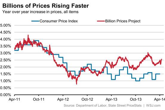
The Twitter source is here. I would stress this is speculative, and I am not trying to argue we should panic about higher inflation. I do, however, take this as additional evidence against the view that these days lack of nominal aggregate demand is a major problem.
Is China now the world’s largest economy?
Christopher Ingraham at The Washington Post has a good short piece on this:
Is China’s economy really set to overtake the United States this year, as manynewsoutletsreported Wednesday morning? Not exactly.
Those headlines come from a new World Bank report that looks at the purchasing power parities (PPP) of world economies. It’s a way of standardizing GDPs across different currencies and economies by “the number of units of a country’s currency required to buy the same amounts of goods and services in the domestic market as U.S. dollar would buy in the United States,” according to the Bank’s definition.
On that measure, China is looking pretty good. As of 2011 (the latest year data are available), its GDP stood at about 87 percent of the U.S. GDP, or 15 percent of the world’s total economic output. This is a huge increase from 2005, when China’s economy was less than half the size of ours.
But there’s a reason that standard measures of GDP don’t use the PPP conversion. As the Wall Street Journal’s Tom Wright explains:
“China can’t buy missiles and ships and iPhones and German cars in PPP currency. They have to pay at prevailing exchange rates. That’s why exchange rate valuations are seen as more important when comparing the power of nations.”
Standard GDP measures take these exchange factors into account. And here, China is doing about as well as one would expect. They’re still the world’s second-largest economy, but their GDP is less than half the size of the U.S. GDP.
This piece is also a good example of just how much economics and financial journalism has improved, post-blogosphere.
Poll data on how much Americans care about inequality — not much
Joseph Lawler reports:
Respondents were not particularly worried about income inequality, which President Obama identified in December as the “defining challenge of our time.” Just five percent said that inequality was a major problem needing attention. And nearly all — 93 percent — of those who listed inequality as a problem said they were not at all or only slightly confident that the government could make real progress in addressing inequality in 2014.
Here is my post from earlier today.
Most of the 19th century was a good time for equality (Department of Ahem…)
From “Real Inequality in Europe Since 1500,” (pdf) by Philip T. Hoffman, David Jacks, Patricia A. Levin, and Peter H. Lindert:
Introducing a concept of real, as opposed to nominal, inequality of income or wealth suggests some historical reinterpretations, buttressed by a closer look at consumption by the rich. The purchasing powers of different income classes depend on how relative prices move. Relative prices affected real inequality more strongly in earlier centuries than in the twentieth. Between 1500 and about 1800, staple food and fuels became dearer, while luxury goods, especially servants, became cheaper, greatly widening the inequality of lifestyles. Peace, industrialization, and globalization reversed this inegalitarian price effect in the nineteenth century, at least for England.
If you have been following the recent debates over Thomas Piketty, you might have come away with…um…the opposite impression. The emphasis there is added by this blogger. As for other countries:
Thus the great grain globalization of the late nineteenth century favored workers’ relative purchasing power in food-importing Western Europe, though not in food-exporting areas.
By the way here is Scott Sumner on consumption inequality.
For the pointer I thank John Nye.
Mobility in and out of the top one percent
From Mark R. Rank:
…Thomas A. Hirschl of Cornell and I looked at 44 years of longitudinal data regarding individuals from ages 25 to 60 to see what percentage of the American population would experience these different levels of affluence during their lives. The results were striking.
It turns out that 12 percent of the population will find themselves in the top 1 percent of the income distribution for at least one year. What’s more, 39 percent of Americans will spend a year in the top 5 percent of the income distribution, 56 percent will find themselves in the top 10 percent, and a whopping 73 percent will spend a year in the top 20 percent of the income distribution.
Yet while many Americans will experience some level of affluence during their lives, a much smaller percentage of them will do so for an extended period of time. Although 12 percent of the population will experience a year in which they find themselves in the top 1 percent of the income distribution, a mere 0.6 percent will do so in 10 consecutive years.
It is clear that the image of a static 1 and 99 percent is largely incorrect. The majority of Americans will experience at least one year of affluence at some point during their working careers. (This is just as true at the bottom of the income distribution scale, where 54 percent of Americans will experience poverty or near poverty at least once between the ages of 25 and 60).
A further example of such fluidity can be found in an analysis by the tax-policy expert Robert Carroll. Using data from the Internal Revenue Service, Mr. Carroll showed that between 1999 and 2007, half of those who earned over $1 million a year did so just once during this period, while only 6 percent reported millionaire status across all nine years.
There is more here, via Greg Mankiw.