Category: Data Source
China estimate of the day (speculative)
Officially, the People’s Republic of China is an atheist country, but that is changing fast as many of its 1.3 billion citizens seek meaning and spiritual comfort that neither communism nor capitalism seem to have supplied.
Christian congregations, in particular, have rocketed since churches began reopening when Communist leader Mao Zedong’s death in 1976 signalled the end of the Cultural Revolution. Less than four decades later, some believe China is now poised to become not just the world’s No. 1 economy but also its most numerous Christian nation.
“By my calculations China is destined to become the largest Christian country in the world very soon,” said Fenggang Yang, a professor of sociology at Purdue University in Indiana and author of Religion in China: Survival and Revival under Communist Rule. “It is going to be less than a generation. Not many people are prepared for this dramatic change.”
China’s Protestant community, which had just one million members in 1949, has already overtaken those of countries more commonly associated with an evangelical boom. In 2010 there were more than 58 million Protestants in China compared with 40 million in Brazil and 36 million in South Africa, according to the Pew Research Centre’s Forum on Religion and Public Life.
Yang, a leading expert on religion in China, believes that number will swell to around 160 million by 2025. That would be likely to put China ahead even of the United States, which had around 159 million Protestants in 2010 but whose congregations are in decline.
By 2030, China’s total Christian population, including Catholics, would exceed 247 million, placing it above Mexico, Brazil and the U.S. as the largest Christian congregation in the world, Yang predicted.
The article is here, via Noah Smith.
The British may distribute mortality information to pensioners
British retirees may soon receive a novel kind of financial advice, courtesy of the state: They could be told when they are likely to die.
“People are living a lot longer, so we have to make sure they have up-to-date information,” the pensions minister, Steve Webb, said Thursday in an interview with the BBC.
“There’s no point being all British and coy about it,” he said. Gender, age and “perhaps asking one or two basic questions, like whether you’ve smoked or not,” Mr. Webb said, should be enough to determine how long, on average, someone is likely to live. Having an idea of life expectancy would help retirees with private pensions manage their finances more efficiently, he said.
There is more here.
The increasing costs of renting
For rent and utilities to be considered affordable, they are supposed to take up no more than 30 percent of a household’s income. But that goal is increasingly unattainable for middle-income families as a tightening market pushes up rents ever faster, outrunning modest rises in pay.
The strain is not limited to the usual high-cost cities like New York and San Francisco. An analysis for The New York Times by Zillow, the real estate website, found 90 cities where the median rent — not including utilities — was more than 30 percent of the median gross income.
In Chicago, rent as a percentage of income has risen to 31 percent, from a historical average of 21 percent. In New Orleans, it has more than doubled, to 35 percent from 14 percent. Zillow calculated the historical average using data from 1985 to 2000.
Nationally, half of all renters are now spending more than 30 percent of their income on housing, according to a comprehensive Harvard study, up from 38 percent of renters in 2000.
That is from Shaila Dewan. And Ryan Avent adds comment.
Department of Uh-Oh
A four-year slowdown in health spending growth could be coming to an end.
Americans used more medical care in 2013 as the economy recovered, new reports show. Federal data suggests that health care spending is now growing just as quickly as it was prior to the recession.
“We’re at the highest level of growth since the slowdown began,” Paul Hughes-Cromwick, a senior health economist at the Altarum Institute, which tracks health spending. “You have to go back seven years to see growth like this.”
There is more here, from Sarah Kliff. Note that is only from one quarter, however. Kevin Drum remains more sanguine.
New data on tax havens, from Gabriel Zucman
Here is the new paper (pdf):
This article shows that official statistics substantially underestimate the net foreign asset positions of rich countries because they fail to capture most of the assets held by households in offshore tax havens. Drawing on a unique Swiss data set and exploiting systematic anomalies in countries’ portfolio investment positions, I find that around 8% of the global financial wealth of households is held in tax havens, three-quarters of which goes unrecorded. On the basis of plausible assumptions, accounting for unrecorded assets turns the eurozone, officially the world’s second largest net debtor, into a net creditor. It also reduces the U.S. net debt significantly. The results shed new light on global imbalances and challenge the widespread view that after a decade of poor-to-rich capital flows, external assets are now in poor countries and debts in rich countries. I provide concrete proposals to improve international statistics.
Loan growth and the taper
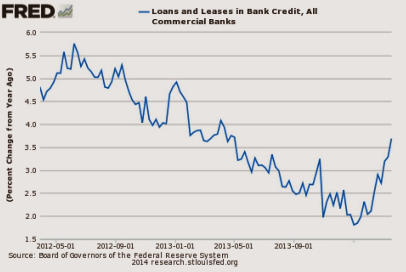
From Sober Look, there is further discussion and pictures here.
Austrian business cycle theory refuses to die
There is a new paper from Princeton by Matthew Baron and Wei Xiong (pdf), preliminary draft but the results are striking:
This paper examines financial instability associated with bank credit expansion in a set of 23 developed countries over the years 1920-2012. We find that credit expansion, measured by the three-year change in bank credit to GDP ratio, predicts a significantly increased crash risk in the returns of the bank equity index and equity market index in the subsequent one to eight quarters. Despite the increased crash risk, credit expansion predicts both lower mean and median returns of these indices in the subsequent quarters, even after controlling for a host of variables known to predict the equity premium. Furthermore, conditional on credit expansion of a country exceeding a modest threshold of 1.5 standard deviations, the predicted excess return for the bank equity index in the subsequent four quarters is significantly negative, with a magnitude of nearly -20%, while the positive predicted excess return subsequent to a credit contraction of the same size is substantially more modest. These findings present a challenge to the views that credit expansions are simply caused by either banks acting against the will of shareholders or by elevated risk appetite of shareholders, and instead suggest a role for optimism of bankers and stock investors.
The pointer is from Hyun Song Shin. I would continue to stress, however, that Austrian approaches still need more Hyman Minsky and should cease putting all of the “blame” — causal, moral, or otherwise — on the monetary expansion of the central bank. Don’t forget my banana point:
Let’s say that the government subsidized the price of bananas, you bought so many bananas, put them on your roof, and then the roof collapsed. Is that government failure or market failure? The price was distorted, but I still say this is mostly market failure. No one made you put so many bananas on your roof.
How do Olympic gold medals influence longevity?
I was intrigued by the new paper by Adam Leive, called “Dying to Win? Olympic Gold Medals and Longevity.” The main results are these:
This paper investigates how status affects health by comparing mortality between Gold medalists in Olympic Track and Field and other finalists. Due to the nature of Olympic competition, analyzing performance on a single day provides a way to cut through potential endogeneity between status and health. I first document that an athlete’s longevity is affected by whether he wins or loses and then detail mechanisms driving the results. Winning on a team confers a survival advantage, with evidence that higher mortality among losers may be due to poor performance relative to one’s teammates. However, winning an individual event is associated with an earlier death. By analyzing the best performances of each athlete before the Olympics, I demonstrate that an athlete’s performance relative to his expectations partly explains the earlier death of winners in individual events: on average, Olympic Gold medalists expected to win, but losers exceeded their expectations. Conversely, athletes considered “favorites” but who fail to win die earlier than other athletes who also lost. My results are robust to estimating a range of parametric and semi-parametric survival models that make different assumptions about unobserved heterogeneity. My central estimates imply lifespan differentials of a year or more between winners and losers. The findings point to the importance of expectations, relative performance, surprise, and disappointment in affecting health, which are not highlighted by standard models of health capital, but are consistent with reference-dependent utility. I also discuss potential implications for employment contracts in terms of a trade-off between ex post health and ex ante incentives for productivity.
The paper is here, and for the pointer I thank the excellent Kevin Lewis.
Is age-adjusted divorce actually way up?
Kay Hymnowitz reports:
According to new research, far from declining since 1980 as researchers thought, age-adjusted divorce rates have actually risen 40%.
She cites this new paper from Demography, by Sheela Kennedy and Steven Ruggles. The abstract is this:
This article critically evaluates the available data on trends in divorce in the United States. We find that both vital statistics and retrospective survey data on divorce after 1990 underestimate recent marital instability. These flawed data have led some analysts to conclude that divorce has been stable or declining for the past three decades. Using new data from the American Community Survey and controlling for changes in the age composition of the married population, we conclude that there was actually a substantial increase in age-standardized divorce rates between 1990 and 2008. Divorce rates have doubled over the past two decades among persons over age 35. Among the youngest couples, however, divorce rates are stable or declining. If current trends continue, overall age-standardized divorce rates could level off or even decline over the next few decades. We argue that the leveling of divorce among persons born since 1980 probably reflects the increasing selectivity of marriage.
You will find ungated versions here. I haven’t had a chance to paw through the argument, but it seemed worth passing along. Hat tip goes to Charles Murray on Twitter.
What do Singapore utility bills look like?
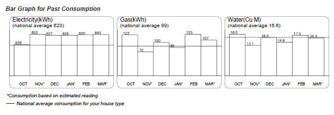

I thank a loyal MR reader — presumably for Singapore — for these images.
Facts about fame (in praise of college towns)
From Seth Stephens-Davidowitz in today’s NYT:
Roughly one in 2,058 American-born baby boomers were deemed notable enough to warrant a Wikipedia entry. About 30 percent made it through art or entertainment, 29 percent through sports, 9 percent through politics, and 3 percent through academia or science.
…Roughly one in 1,209 baby boomers born in California reached Wikipedia. Only one in 4,496 baby boomers born in West Virginia did. Roughly one in 748 baby boomers born in Suffolk County, Mass., which contains Boston, made it to Wikipedia. In some counties, the success rate was 20 times lower.
…I closely examined the top counties. It turns out that nearly all of them fit into one of two categories.
First, and this surprised me, many of these counties consisted largely of a sizable college town. Just about every time I saw a county that I had not heard of near the top of the list, like Washtenaw, Mich., I found out that it was dominated by a classic college town, in this case Ann Arbor, Mich. The counties graced by Madison, Wis.; Athens, Ga.; Columbia, Mo.; Berkeley, Calif.; Chapel Hill, N.C.; Gainesville, Fla.; Lexington, Ky.; and Ithaca, N.Y., are all in the top 3 percent.
Why is this? Some of it is probably the gene pool: Sons and daughters of professors and graduate students tend to be smart. And, indeed, having more college graduates in an area is a strong predictor of the success of the people born there.
But there is most likely something more going on: early exposure to innovation. One of the fields where college towns are most successful in producing top dogs is music. A kid in a college town will be exposed to unique concerts, unusual radio stations and even record stores. College towns also incubate more than their expected share of notable businesspeople.
African-Americans who grew up around Tuskegee did very well in achieving Wikipedia fame. Yet how much a state spends on education does not seem to matter. And this:
…there was another variable that was a strong predictor of Wikipedia entrants per birth: the proportion of immigrants. The greater the percentage of foreign-born residents in an area, the higher the proportion of people born there achieving something notable. If two places have similar urban and college populations, the one with more immigrants will produce more notable Americans.
The piece is fascinating throughout, and you will note that Seth is a Google data scientist with a Ph.d. in economics from Harvard. His other writings are here. Some of you may wish to see my book What Price Fame?
How well do the Irish remember what price they paid for their homes?
It may be the single biggest purchase in their lives but most Irish homeowners have less than total recall when it comes to remembering just how much they paid for their homes, according to new research published by the Central Bank.
More than 60 per cent of those surveyed claimed to have paid substantially less for their homes than they actually did with most of those questioned getting the purchase price wrong by tens of thousands of euro.
More than 20 per cent of those polled underestimated the price they paid for their home by up to €30,000 while closer to 30 per cent were out by between €30,000 and €120,000.
Could the mechanism be regret minimization?:
“Perhaps people are trying to reassure themselves that their losses as a result of the property crash are not as great as they are,” Mr McQuinn told The Irish Times. “We can’t really say that with 100 per cent certainty but given the scale of the negative equity involved in many of the homes, it certainly looks that way.”
The article is here, the research paper is here (pdf) and for the pointer I thank Aidan Walsh.
How much is Chinese defense spending really going up?
I don’t feel I have gotten to the bottom of this, but here is an interesting contrarian perspective:
“According to my records, 2013 is the second year in a row in which China’s actual defense spending wound up being significantly less than was announced at the beginning of the year,” said Roger Cliff, senior fellow with the Asia Security Initiative at the Atlantic Council.
“The announced budget in March 2013 was … an increase of 10.7 percent over 2012. Actual expenditure in 2013 was … an increase of only 7.6 percent over 2012.”
The announced increases also never account for inflation, Cliff said. “Inflation in 2013 was expected to be 3.2 percent, official inflation figures for 2013 haven’t been released yet, as far as I know, so the increase in defense spending from 2012 to 2013 was only 4.3 percent in real terms.
“In fact, since 2009, China’s defense budget has grown by an average of only 4.7 percent in real terms,” Cliff said. “And yet, because the increases are always announced in nominal terms, not real terms, and the budgets announced at the beginning of the year have been exceeding the amount actually spent, everyone is still talking about ‘annual double-digit increases in China’s defense spending.’ ”
The full article is here.
How to improve referee performance
Via Michael Makowsky, there is a new and extremely useful paper by Chetty, Saez, and Sandor in “slides” form (pdf). Their conclusions include these:
1. Short deadlines for referees are extremely effective at increasing speed.
2. Cash incentives can generate significant improvements with salient reminders right before a deadline.
3. Even light social incentives, such as direct prods from an editor, can bring significant benefits.
More broadly, at least in this context cash incentives work, they do not displace social incentives, and attention really matters as do “nudges.”
Sentences to ponder
Artists grew up in households w/typically higher incomes than doctors did…
There is more information here, along with a picture, and the original story here.
Addendum: Cowen and Tabarrok once wrote on this topic.